The UPDATED Synergos 2020 Census Plan

What to expect in 2023.

The UPDATED Synergos 2020 Census Plan

What to expect from Synergos in 2023.

February 16th, 2023 Update

Since our last update in July 2022, there have been no further updates from the Census Bureau regarding the release of the DHC file. However, we are excited to announce that we are moving up the release of our first 2020 Census baseline estimate from October to July, as we now feel confident in a quick turnaround, dependent on a May 2023 release of the DHC file. As a portion of our customer base has started to use 2020 geographies we have provided our customers with crosswalk tables to help with the translation. To make this transition smoother for our users, a 2010 Census based version translated to 2020 geographies will be available with the April release.

Here’s what to expect from our upcoming releases:

  • The April 2023 release will be the first version with a 2020 geography option. Both 2010 and 2020 geography versions will be available. The estimates themselves will continue to be based on a 2010 Census baseline.
  • The July 2023 release, which will follow the Census Bureau’s expected release of the 2020 DHC file in May, will be the first version based on the new 2020 baseline. We will also provide a 2010 geography translation version for this release.
  • The October release will be the first version available only on 2020 geographies.

What makes Synergos unique, and the reason why we’re the preferred data provider to the majority of industries where site location is mission critical, is that we’re the best at balancing between speed and thoroughness. We appreciate your trust and look forward to navigating these changes with you.


The following Q&A section will hopefully address most of your remaining questions, but please don’t hesitate to reach us through our Contact Us form, or through your primary contact at Synergos for additional information.

 What data specifically is missing, and what data from the 2020 Census has been used in the most recent STI:PopStats estimates?

The low level geography counts that have not yet been released, and which are critical to us for performing a full rebuild are; households, persons per household, vacancies,  age distributions, and race distributions by age.

Has the ACS release in March 2022 been used to produce the current estimates?

In short, yes. The ACS, which is normally delivered in December, was delayed for the first time ever to the end of March of 2022, which means our Q3 July 2022 release, will be the first to leverage this data. Additionally, this ACS data was published on 2020 Geographies and had to be translated to 2010 geographies for incorporation into our products.

Should we be concerned with the results reported by the Post Enumeration Survey (PES)?

The Census Bureau reported that their PES showed an undercount in six states, and an over count in eight states. Given that the PES is based on a 114,000 household survey and on a theoretical model that the Census doesn’t disclose, we ultimately trust the data reported in the Census as the ultimate truth to rebuild our models. For more on the PES click here.

How does this situation compare to the 2010 Census release? 

The SF1 file for the 2010 Census had several versions. The first version was a state-by-state release that occurred between June and August 2011. This allowed us to have our conversion to the 2010 geographies completed by the October 2011 release. If the Census Bureau releases the DHC data around May 2023 that will be about two years behind how the 2010 Census release went.

Why the delay with the 2020 Census Release?

Previous delays could be partially attributed to the Covid-19 pandemic. The current delay centers primarily on the Bureau’s effort to devise a mechanism for keeping personally identifiable information confidential. This is referred to as Differential Privacy, and this evolving methodology will continue to delay an already late release until the Bureau deems it is satisfactorily accomplishing its purpose.  Hopefully this time, the Census Bureau’s publication date of May 2023 holds and does truly provide the necessary time for them to complete this task. 


Curious about PopStats? Reach out and we’d be glad to help!

 Contact Us


Economic Development in Top Growth Markets

GDP per capita in top growth markets is either slowly increasing, or not at all.

Economic Development in Top Growth Markets

GDP per capita in top growth markets is either slowly increasing, or not at all.

As shocking as it may sound, only 2 of the 5 top growth markets in the United States have a higher GDP per capita now than they did in 2007 after adjusting for inflation. Take a look at these 5 markets and how they compare to their states and the nation.

Running the Numbers

We derived this insight by tracking  GDP per capita using our GDP and population fields from 2007 to 2021. We then adjusted these numbers for inflation, based on BEA data, to create an accurate view of how these markets are progressing. The graph below shows how each market stacks up against each other, their states, and the nation (y-axis is in thousands):

gdp per capita adjusted for inflation line graph

There are several different ways GDP can be measured. Our GDP estimates are a GDI (Gross Domestic Income). This allows us to create estimates at a local level and is equivalent to GDP on larger levels. The following four incomes are considered: farm income, personal income, business income, and government income (taxes).

Diving Deeper

If you take a look at the spreadsheet above, the last column reveals that only one market (Charleston) has had a substantial amount of GDP per capita growth that also beat the nation. Two markets, Myrtle Beach and Phoenix, exhibited a decline in GDP per capita, and Boise is hardly displaying an increase. Two economic crashes occurring within the last 14 years are likely large contributing factors to these trends.

The inference that can be made is that the populations moving to these markets add a lower amount of per capita output than the starting per capita output level.

The October release for the July 2021 estimates is available now!

Learn More About PopStats

4 of the 5 Most Active Grocery Retailers are PopStats Customers

Here’s why.

4 of the 5 Most Active Grocery Retailers are PopStats Customers

Here’s why.

“Click and Carry” (pickup) is fueling e-commerce for grocery retailers across the nation. This new trend isn’t showing any sign of slowing down, but the fight for the perfect store location is still being fought. 

BuildCentral recently released an article listing 2021’s Top 5 Most Active  Grocery Retailers in America. It dives into the topic that regardless of the digital age, grocery stores are still ramping up construction of their brick and mortar stores.

Out of the 5 grocers listed in the article, 4 trust STI: PopStats™ to power their market strategy and site-location decisions.  These top grocers use PopStats because it is the most up-to-date and accurate geospatial dataset on the market.  

This article will dive into the different reasons why they choose PopStats and other Synergos datasets again and again.

Want a free sample of PopStats? Contact us today!

Get A Free Sample

“By applying variables from PopStats, like income, age, and ethnicity, to our analysis, we can do that, even at lower geographic levels — and with extreme confidence.”
“…with PopStats we’ve found that the data stays consistent and the error rate stays small. This is important to us because the more accurate the data is, the better informed our decisions are.”

Here at Synergos Technologies, we work under a policy we call, “ACT.” 

  • A – Accuracy
  • C – Comprehensive
  • T – Timely

Everything we create and do must fall under these three pillars. They help us to create quality products and services that maintain our status as industry leaders. Let’s dive into how our full data suite falls into these pillars. 

Accuracy

Many PopStats customers use our datasets due to their accuracy and dependability. Those attributes come from proven methodologies that allow you to make confident decisions. 

There are many different ways are able to check data quality and ensure accuracy in every release. One way is through a “Q&A” process. This is a robust process that involves testing the final product with proprietary procedures before we release the product. We are also constantly creating maps and graphs to see if we can catch any data discrepancies (we like to post our most interesting discoveries online).

Another way we prove the effectiveness of our methodologies is by comparing our estimates to Census and ACS numbers. Our Accuracy whitepaper shows the numbers and how close our population estimates were to the 2010 census.  PopStats counted 99.998% of the United States population. Fast forward 10 years to the 2020 census and PopStats counts 99.993% of the population. That’s 20+ years of exceptional accuracy that our competitors aren’t able to achieve.

Out of anyone else in the industry and our competitors. Our estimates were the closest to the Census results. We were even closer than the Census’s own preliminary estimate.

Comprehensive

Comprehensive to us means that we have so many unique, accurate, and updated variables, that you will be able to extensively understand your site-selection research. A few unique variables we create are religion, discretionary income, and economic variables like GDP and mortgage risk. PopStats has the largest selection of fields in a single demographic product (over a thousand), and we update it quarterly.

Moving along, every variable in our datasets is backed by trusted and official sources. Most use more than one source! Some sources that our datasets use are:

You can contact us if you’re interested in learning about our full list of data sources.
 
We then use proprietary mathematic models to shape the data into estimates. All of these steps create robust datasets that can be used to effectively make decisions beyond site location like what items to stock on the shelves or what kind of advertising would be effective in an area. The opportunities are endless.
 

Timely

Uniquely, in the realm of demographic estimates, PopStats is the first and only dataset to be released quarterly. No other data provider can duplicate that process a the level of accuracy we do it at. The struggle with that is on-time releases. Synergos Technologies is proud to say that of our 25+ years in business we have never been late on a PopStats delivery. We understand our customers are working diligently to find the best sites for their new store locations. That’s why we also work diligently to make sure they have the tools they require when they need them.

Another factor in our reliability is our industry-leading customer service. Being able to pick up the phone and talk to a person immediately is a thing of the past for most businesses. Not with us. We always have someone at the phone ready to answer questions immediately during business hours. Additionally, we have created multiple points of access to our customer service like email and our new website chatbox. Our excellent system allows us to be proud to say that all customer inquiries are answered within a day of contact, and often within the hour. 

Interested in learning more? Contact us today!

Learn More About PopStats

– Extra Material –

The Most Livable Counties – A Discretionary Income Analysis

Consumer spending habits and discretionary income determine the quality of life for many Americans. Which counties are experiencing the best?

The Most Livable Counties – A Discretionary Income Analysis

Consumer spending habits and discretionary income determine the quality of life for many Americans. Which counties are experiencing the best?

America is beginning to return to a more normal state of living. Now that the COVID-19 pandemic is seemingly coming to an end, consumer spending is beginning to increase again. We used STI: PopStats™ data to analyze average household incomes and discretionary incomes to determine where the most livable cities/areas across the country are, and to see where spending is likely to increase the most. 

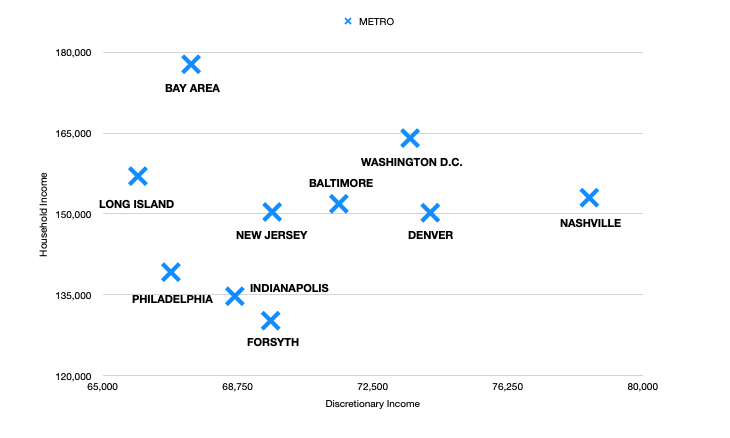
The ranking for the following cities/areas was determined by comparing average discretionary income versus the average household income in a county. The counties with the most discretionary income to spend on goods not considered necessities are ranked higher. With consumer spending ramping back up in America, the areas with more discretionary income will be spending more than others. 

Along with our rankings, we included economic indicators unique to the PopStats product like ‘Gross Domestic Product’ and ‘Mortgage Risk.’ These unique variables give further insight into our clients’ potential customers and their custom customer profiles. Mortgage risk is an interesting variable in that it rates an area on its chances of defaulting on a mortgage from 1 to 5, 5 being most likely and 1 being least likely.

All numbers and figures used in this analysis are sourced from STI: PopStats™. Contact Us to learn more about the 1000’s of variables we update quarterly.

Most Livable Counties in the United States

10. Nassau County – Long Island Area

  • Population: 1,356,138
  • Average HH Income: $157,016
  • Average Discretionary  Income: $65,977
  • GDP per Capita: $111,661
  • Mortgage Risk: 3.2672
  • Average Disposable Income: $107,841

This county is the first county outside of New York City. A theme that you are going to notice through the rest of this analysis is that “most livable cities” are actually areas right outside of thriving metropolitans. These professionals are benefitting from high salaries and then escaping back to more affordable real estate. This combo allows for more discretionary income worth the extra time spent in the car.

9. Philadelphia – Chester County

  • Population: 533,178
  • Average HH Income: $139,215
  • Average Discretionary Income: $66,893
  • GDP per Capita: $91,027
  • Mortgage Risk: 2.7338
  • Average Disposable Income: $99,520

With a population of over 500,000, Chester county hosts several cities that are reaping the benefits of having a manageable drive time to Philadelphia. 

8. The Bay Area

  • Population: 3,816,251
  • Average HH Income: $177,761
  • Average Discretionary Income: $67,454
  • GDP per Capita: $148,538
  • Mortgage Risk: 3.9355
  • Average Disposable Income: $118,504

Several counties in the bay area made the cut. This analysis is comprised of the following counties: Marin, San Mateo, Santa Clara, San Francisco.

It’s not a common thought to think of the bay area as livable with their housing crisis and homeless problem the area faces; however, looking at the data shows that those employed (especially in the booming tech industry) are able to fully utilize everything the area has to offer.  

The bay area has the highest average household income on the list as well as the highest GDP per capita. The affordability of the city plays a heavy role with the fact that this area has the highest difference between income and discretionary income. 

7. Indianapolis – Hamilton County

  • Population: 353,562
  • Average HH Income: $134,750
  • Average Discretionary Income: $68,669
  • GDP per Capita: $81,691
  • Mortgage Risk: 2.7086
  • Average Disposable Income: $97,894

Hamilton County is what you can consider a “healthy economy.” Their economic vitality score places them right on par with the national average. This along with high spending potential make it a solid area to live. 

6. Forsyth County, GA

  • Population: 253,007
  • Average HH Income: $130,218
  • Average Discretionary Income: $69,663
  • GDP per Capita: $81,203
  • Mortgage Risk: 3.0771
  • Average Disposable Income: $100,934

Although this is the most rural county on our list, their incomes and spending power allow them to put up a good fight. Forsyth County has the highest economic vitality index on the list but the lowest GDP per capita. 

5. New Jersey (New York Suburbs)

  • Population: 824,369
  • Average HH Income: $157,070
  • Average Discretionary Income: $69,707
  • GDP per Capita: $106,938
  • Mortgage Risk: 2.8996
  • Average Disposable Income: $108,721

This is another area with several counties making this top cities list. The counties included are Morris and Somerset.

A commute from a Jersey town to the bustling island of Manhattan is a pop culture reference at this point. With their close proximity to high incomes and the availability of more affordable real estate, it’s not hard to believe these counties host some of the most livable cities. 

4. Baltimore – Howard County

  • Population: 330,939
  • Average HH Income: $151,890
  • Average Discretionary Income: $71,558
  • GDP per Capita: $90,908
  • Mortgage Risk: 3.2304
  • Average Disposable Income: $110,736

This county has an advantage that no other county on this list has. This county is sandwiched between two major metropolitan cities (Baltimore being the closest). The residents of this county get to benefit from both Washington D.C. and Baltimore.

3. Washington D.C. – Loudoun and Fairfax County

  • Population: 1,556,521
  • Average HH Income: $164,066
  • Average Discretionary Income: $73,537
  • GDP per Capita: $92,160
  • Mortgage Risk: 3.4726
  • Average Disposable Income: $116,647

The capitol city is hosting quite a few different neighboring counties on this list. Loudoun and Fairfax are benefitting from the city the most. These counties are enjoying healthy economies. The discretionary incomes in these areas are mirroring some people’s entire income. 

2. Denver – Douglas County

  • Population: 367,726
  • Average HH Income: $150,232
  • Average Discretionary Income: $74,097
  • GDP per Capita: $81,981
  • Mortgage Risk :3.4863
  • Average Disposable Income: $110,941

For a city of its size, Denver has a relatively high cost of living. That does come with some great salaries. The neighboring counties, like Douglas, are the ones taking the most advantage of that. 

The most livable county in America:

1. Nashville – Williamson County

  • Population: 250,620
  • Average HH Income: $153,023
  • Average Discretionary Income: $78,515
  • GDP per Capita: $98,173
  • Mortgage Risk: 3.2665
  • Average Disposable Income: $112,789

Austin didn’t make the top 10 in a city list? Not this time. A Nashville county currently holds the rank as the most livable city in America according to our discretionary income data. Between the cost of living and the cost of real estate in Tennessee, residents are able to afford to shop and spend lavishly. 

scatter plot of the top 10 liveable counties

Everyone’s definition of the most livable city/county will be different. Spending on necessities takes a large portion of our annual salaries. The money that is left over is what we can spend on pleasantries and entertainment like vacations, luxury goods, gifts, etc. Having the ability to spend on activities and goods like that are what make cities livable and popular. 

Using variables like discretionary income and comparing them to staple variables like household income and mortgage risk can make for effective customer profiles and city stories. Combining different datasets and cross analyzing data is how you make effective and profitable site-location and related decisions. 

STI: PopStats and STI: Spending Patterns made this analysis possible. Contact us to learn how you can put our data to work for you.

Put Data into Action

The Synergos 2020 Census Plan

What you can expect from your data partners with the 2020 Census.

The Synergos 2020 Census Plan

What you can expect from your data partners with the 2020 Census.

October 19, 2021 Update

As the Census Bureau continues to work through its releases, we wanted to update you on their status and how their past and future releases are incorporated into our products. We put together this Q&A to address most of your questions regarding the process and our updated schedule for fully incorporating the 2020 Census and releasing estimates with 2020 geographies. Please read carefully and don’t hesitate to reach out should you need clarification or further discussion on any point.

What Census 2020 data has been released?

  • The first 2020 Census data released by the Census Bureau in late April 2021 included only Population counts on a State level of geography. Then in August 2021 they released the redistricting data, also known as the P.L. 94 data. This data was released in other formats in mid-September. The P.L. 94 data includes fields for Population, Race, Ethnicity, Housing units, and Voting Age at a Census Block level of geography. 

How has that data been incorporated into PopStats?

  • The first incorporation was with our July 2021 release. We used the Census 2020 state-level figures to adjust our county-level control population totals. With the latest October 2021 release, we have used the P.L. 94 data to adjust the county-level control population totals. This integration method has kept our models based on 2010 geographies but still allows for some adjustment based upon the 2020 Census data. Most areas saw only slight changes. Areas that saw more effect were areas like New Jersey, which we undercounted compared to the 2020 Census, and Arizona, which we overcounted. 

What data are we waiting on for a full rebuild based upon 2020 geographies and lower-level data?

  • The Demographic and Housing Characteristics File (DHC) includes data that in 2010 was previously included in the SF1 file. This data includes several key breakouts that are necessary for rebuilding our estimate models based on the new 2020 geographies. These include households, age, sex, race, and their cross tables, among others. The household count and other detailed breakout fields are imperative to rebuild the estimate model. It should be noted that the P.L. 94 data does not contain a household count and many other critical breakouts. 

What is the current estimated timeline for a complete 2020 based version? 

  • The Census Bureau does not have a precise date set for the release of the DHC and Detailed DHC and never has given one. Previously the rumors, among mostly state demographers with which the Census coordinates, indicated state-by-state releases from late August 2021 through December 2021. Based upon this we have currently and tentatively set our 2020 update schedule for the April and July releases in 2022. However, none of those files have been released to date. Currently, they list “Tentatively 2022” on the main Census 2020 web page. And in the Stakeholder Engagement plans just released in September there is slightly more detail for the DHC timeline. This source indicates that the DHC will “Begin Production”, after two rounds of format and privacy review and public comment that are to occur in Winter and Spring. This timeline indicates they will start producing the DHC files in Summer 2022. If that is the case, and we really hope it isn’t, we will make every attempt to meet an October 2022 release. 

How does this compare to the 2010 Census release? 

  • The SF1 file for the 2010 Census had several versions. The first version was a state-by-state release that occurred between June and August 2011. This allowed us to have our conversion to the 2010 geographies completed by the October 2011 release. If the Census Bureau releases the DHC data around June that will be about a year behind how the 2010 Census release went.

Why the delay?

  • The Census Bureau had a major early issue with conducting the 2020 Census, the Covid-19 pandemic. The ultimate effects of this were a delay of only a few months. An impressive testament to the Census Bureau’s ability to adapt. This is why we, along with other industry demographers, expected state-by-state releases between August and December 2021. Just a slightly lagged version of the 2010 SF1 file release schedule. That was until last month’s Stakeholder Engagement plans indicated that this data would not be released until it could be revised for differential privacy noise injection, which is the bureau’s new additional mechanism for keeping personally identifiable information confidential. This will end up further delaying an already late release. 

We were the first demographic data company to release a 2010 Census based estimate, and we’re committed to leading the pack in releasing accurate estimates with the 2020 Census. We appreciate that you chose Synergos products because of our uncompromising commitment to quality and the timeliness of our releases, and we are eager to continue to prove our value as we work towards a 2020 Census based estimate.

If you have any questions, please don’t hesitate to give us a call at (512) 343-1963 or simply chat with us right here.

Curious about PopStats? Reach out and we’d be glad to help!

Learn More Census Bureau Website

Recerational Equipment, Inc. (REI)

REI Accelerates New Store Openings with PopStats and LandScape

Recerational Equipment, Inc.

REI Accelerates New Store Openings with PopStats and LandScape


It would be easier for Recreational Equipment Inc. to use another data provider’s dataset because the company that creates their sales forecast models uses it. However, Curt Newsome, REI’s real estate research and strategy manager, said, “I don’t care. I want to use PopStats and LandScape.”

He prefers PopStats and the LandScape neighborhood segmentation dataset for two main reasons: “PopStats is high-quality data and the company is accessible. If I have a question about the data, I can call and get an answer. The team there is very accessible and supportive. I don’t get shuffled to people who don’t have answers. In fact, they often give me more detail than I can absorb.”

“That’s important to me because I’ve worked with lesser quality data and it’s a case of ‘you get what you pay for.’” Curt added: “… data isn’t just a sideline for them. It’s their core. They know their methodology inside and out. That’s why they have the best reputation in the business.”

Quality data that he can depend on is critical to Curt’s research success, in particular, because REI only opens a few new stores each year. As a result, they have to be in the exact right locations.

“Our store location history has gone through many phases, including having no strategy whatsoever and letting real estate brokers decide where we’ll open stores. Now, we’re in the ‘age of enlightenment,’ where we open new stores based on both the science of analyzing revenue potential and the art of our real-world experience.”

In particular, one of the organization’s goals is to make REI better known outside of the West Coast, where it originated. More than a third of REI stores are in California, Oregon, and Washington. However, the company has since expanded into new markets like Jacksonville, Fla., Kansas City, Mo., and Columbus, Ohio. Along with new locations, the company also began considering new store concepts and a separate strategy for more flagship locations.

STI: LandScape™ Correlates with REI Customers

Today, Curt relies on both PopStats and LandScape to scout new territories for new stores and assess the status of existing stores. “Our process begins with segmenting our target markets using LandScape, so we can create our forecast models. It’s our critical first step because REI’s customer profiles are extremely segmented in comparison to most other retailers.”

“LandScape segments do an incredible job of correlating to our ideal customer segments,” said Curt. “In fact, the 72 segments’ correlations are so meaningful to REI that the company will ignore a lower population count in a market if it finds a large enough population of its ideal segments.

“LandScape allows us to perform a unique calculation to understand a market with different demographic qualities,” notes Curt. “That’s why it’s become one of the key building blocks in our models when we are researching trade areas where we don’t already have stores.”

Before applying LandScape data to its research, REI processed a year’s worth of transactional data — about one million records — including every sale and every return. It geo-tagged each data point. That showed them where members live, where members shop, and what they buy.

By mapping that data against the retailer’s dominant cluster data, REI was able to assign a score for all 72 segments in LandScape on the segments’ propensity to shop at REI. That allows the company to, simply stated, assign a score to any geographic area and gauge how likely REI is to be successful there. “It’s just as important to know all the segments that score low as to know all of the segments that score high.”

About 15 segments in LandScape deliver the highest probability of being REI customers. However, Curt stresses: “That doesn’t mean that we’ll only put stores where those consumers live. There are many other factors that we consider as well.”

Among the other factors, we are looking at alternative sites where there is no residential customer base. Instead, it’s a place that people travel to for outdoor recreation, like Conway, New Hampshire, and Dylan, Colorado. “Since we’re running out of standard places to open new stores, we’re expanding our search into alternative store locations and types,” explained Curt.

Applying Art and Sciene to Trade Area Analysis

After forecasting its customer segments, Curt moves onto trade area analysis, relying on PopStats to compile relevant data on each trade area’s demographic characteristics. “The purpose of this analysis is to determine if a strategically validated relationship exists between the site’s attributes and our ideal store performance.”

REI’s site analysis includes three typical scenarios:

  1. Model Validation – In a normal trade area, “we track the prediction using variables such as trade area capture rates, sales per population, and total sales per household.”
  2. Increase Forecast – Some markets need a manual boost in estimates for a variety of reasons, such as Burlington, Vermont. “Not surprisingly, REI’s capture rate is very high there,” noted Newsome. “Almost everyone is a potential customer. Plus, we get a bump from the local university.”
  3. Decrease Forecast – If a market looks different demographically or has a lower population, Newsome will manually lower the forecast. “For example, in Salem, Oregon we decided to open a smaller store. Today, it’s a good steady performer.”

So how accurate is REI’s new market analysis processes? “We haven’t measured the raw model yet, but we’ve opened about 30 new stores using this methodology. We’ve only under predicted by about three percent of the time, which is great compared to the industry standard of 15 percent.”

Interestingly, in REI’s over 80-year history the company has rarely closed a store. But in 2015 the company closed its first one and has relocated a couple of stores since then. Newsome is so confident with his current research process that he says: “If we had the model we have now when he opened that now-closed store, we never would have opened it in the first place.”

Backed by trade area research it can trust, REI plans to continue opening new stores at a pace of anywhere from two to 12 per year.

Want to accurately predict your store openings like REI? Contact us for a free sample!

Get a free sample REI’s Website

Weingarten Realty

Weingarten Realty Enjoys Utmost Confidence in the STI: PopStats™ Estimates

Weingarten Realty

Weingarten Realty Enjoys Utmost Confidence in the STI: PopStats™ Estimates

Confidence is the number one benefit Weingarten Realty receives from STI: PopStats’ quarterly population estimates, says the company.

Weingarten’s confidence in the accuracy of STI: PopStats began with its first look at the demographic data in an Arizona test market. “PopStats picked up people that we otherwise would have missed,” says Kyle Kretsinger, Director of Research/Marketing Services for the commercial real estate company based in Houston, Texas.

“In fact, another data vendor’s product missed this population entirely in a side-by-side comparison,” Kyle adds. While the population estimates from the other data provider showed no population in both one-mile and two-mile trade area rings, PopStats estimated 3,000 and 6,000 people respectively. “These numbers are significant. They can make or break a new project.”

Weingarten’s confidence has only gotten stronger since its introduction to PopStats data — which has helped the company not only make better decisions but also save money.

another weingarten project

Saving Research Costs

“Our confidence in PopStats’ numbers is so high that we greatly reduced the number of housing studies we conducted in growth markets,” explains Kretsinger.

Typically, the real estate development company surveyed homebuilders that were building new subdivisions in new markets. The price tag for these in-field services was anywhere from $4,000 to $8,000, depending on if Weingarten conducted the research itself or used a third-party research firm. They were a significant expense, with up to 20 housing studies a year conducted when the company was focused on new developments.

“Even if we conducted the research ourselves, there are many costs, including airfare, hotels, meals, and time out of the office,” notes Kyle.

“After we started using PopStats we were able to replace most housing studies with PopStats’ quarterly growth trends — that’s how certain we are of the data’s ability to see populations in markets as they are growing.”

“PopStats has the unique ability to give us a very high comfort level without needing to spend the money to feel comfortable with our decisions,” adds Kyle.

Gaining Workplace and Seasonal Insight

Along with saving on housing studies, Kyle says that PopStats data has also saved the company the expense of conducting workplace studies. “We used to go into new markets and count how many businesses were there. Then apply a formula to determine how many people worked in the area. The number is important to our clients who rely on a certain percentage of daytime population for their business operations.

“Now, PopStats provides us with accurate workplace population counts — which we also have the utmost confidence in. This is another great convenience and savings.”

With several shopping centers located in the Southern part of the U.S., seasonal population trends are also a valuable form of demographic insight for Weingarten, notes Kyle. “PopStats is the only data that allows us to track seasonal trends. With its quarterly population updates, we are able to clearly see the seasonal fluctuations in our markets. We can share this insight with our tenants, so they can make more informed business decisions as well.”

Speaking the Same Language

With the high-growth boom on hold for the time being, Weingarten is focused on managing the property it currently owns. This includes marketing its existing space to retailers. “PopStats data comes in handy for marketing our properties,” notes Kyle. “We can show potential clients what population exists and what changes are expected. All companies do a better job when they understand the dynamics of a trade area’s population.”

Kyle notes that many of Weingarten’s larger retail clients like grocers and restaurants already use PopStats data in their own market research activities. “This is great because we are all speaking the same language when discussing population counts and characteristics.”

To gain utmost confidence in your market research like Weingarten, contact Synergos Technologies today about the STI: PopStats data suite today.

Get a Free Sample Visit Weingarten’s Website

The Highest Home Values in Texas

In a market this hot, which county is the hottest?

The Highest Home Values in Texas

In a market this hot, which county is the hottest?

Being that Texas is as large as it is, the lone star state’s home values can vary vastly across the market. According to PopStats data, the average Texas home value in January 2021 was $280,816. Some counties blow that number out of the water. Let’s take a closer look at the top 10 counties with the highest home values. 

All numbers and figures used were created using STI: PopStats™ data. Contact us to learn about the thousands of other variables we update quarterly. 

Top 10 Counties With the Highest Home Values

10. Bexar County (Primarily San Antonio) 

san antonio river walk

Population: 2,063,682

2021 Average Home Value:  $248,578
2020 Average Home Value:  $238,003

Average Household Income: $82,607

San Antonio is the major city for Bexar County and sits at number 10 on our list for home values. The counties that are listed higher are counties of the 3 other major cities of Texas, and the counties that make up their suburbs. San Antonio just so happens to also rank number 10 in Texas counties for average household income.

9. Harris County (Primarily Houston)

Population: 4,720,553

2021 Average Home Value:  $294,658
2020 Average Home Value:  $285,051

Average Household Income: $96,504

Harris County is a massive county in that it encompasses all of Houston (the 4th most populous city in the United States) as well as a few of Houston’s suburbs including Katy, Baytown, Friendswood, etc. The size of Harris County attributes to its status as the most populated county in the state, as well as the 3rd most populated county in all of the United States. 

8. Dallas County (Primarily Dallas)

Population: 2,617,867

2021 Average Home Value:  $344,135
2020 Average Home Value:  $332,705

Average Household Income: $94,526

Dallas County is self-explanatory in its name. Although Dallas ranks in the top 10 of Texas counties in home values, its suburbs dominate several rankings in this category. 

7. Tarrant County (Primarily Fort Worth)

Population: 2,111,344

2021 Average Home Value:  $300,664
2020 Average Home Value:  $289,162

Average Household Income: $96,056

People living in Dallas County (more specifically Dallas) may be living there for the amenities that larger cities offer like job opportunities, nightlife, entertainment, etc.  Within the same metro, although smaller and not as vast, is another large city that offers similar amenities – Fort Worth. Ranking 7 in our list, people living in Tarrant county can experience similar amenities, as well as higher home values and better household incomes. 

6. Montgomery County (Houston Suburb)

Image Source: zippsliquor.com/break-room/upcoming-summer-events-in-conroe/

Population: 630,248

2021 Average Home Value:  $338,042
2020 Average Home Value:  $327,020

Average Household Income: $117,377

Our first suburb on the list and it’s one that sits right outside of the massive city that is Houston, Texas. This county is bliss suburbia in that it enjoys having close access to city amenities like incomes, jobs, and entertainment, while also maintaining a healthy housing market.

5. Fort Bend County (Houston Suburb)

Image Source: https://www.visitsugarlandtx.com/blog/post/7-ways-to-enjoy-an-awesome-weekend-in-sugar-land/

Population: 839,981

2021 Average Home Value:  $339,863
2020 Average Home Value:  $328,781

Average Household Income: $127,003

Another Houston suburb making the list, but this time in the southwestern part of the Houston metro. Fort Bend County only offers slightly higher home values than Montgomery County but boasts a significant higher population. 

4. Williamson County (Austin Suburb)

Image Source: https://visit.georgetown.org/

Population: 635,242

2021 Average Home Value:  $390,100
2020 Average Home Value:  $365,462

Average Household Income: $110,183

Our first mention of Austin on this list and it’s one of the suburb counties. This county’s home values are rising even faster than Austin’s! But only barely. With a 1 year change of 6.7416% increase over last year, Williamson County is doubling the national average in rising home values. 

So far, we have mentioned most of the major counties in Texas and a few of their suburbs. With only 3 left in our top 10, keep reading to find out which counties have the highest home values in the state of Texas.

3. Denton County (Dallas Suburb)

Population: 924,022

2021 Average Home Value:  $396,122
2020 Average Home Value:  $382,967

Average Household Income: $117,656

Our first Dallas suburb hitting the list enjoying similar benefits as Houston’s suburbs. With an average drive time of 45 minutes to get to downtown Dallas, living in Denton is very advantageous for a variety of different households.

2. Collin County (Dallas Suburb)

Image Source: http://www.discovercollincounty.com/mckinney-texas/

Population: 1,072,393

2021 Average Home Value:  $437,460
2020 Average Home Value:  $422,931

Average Household Income: $117,656

2 of the 3 counties in Texas with the highest home values are both Dallas suburbs. It makes sense with how the DFW metropolitan area offers numerous job and travel options to many industries.  

The Texas county with the highest home values is: 

1. Travis County (Primarily Austin)

Population: 1,329,463

2021 Average Home Value:  $536,117
2020 Average Home Value:  $502,257

Average Household Income: $116,445

Out of every county in Texas, Travis County has the highest home values out of all of them! They aren’t just the highest, they’re all growing at an exceptional rate. The Travis County market is growing 78% faster than the national average. Many factors are contributing to this like a booming tech industry, a large number of entertainment jobs, and they are consistently making it on our annual top growth markets report.

Travis is the only major county to beat its metro counties, and it beats them in both home values and income. Travis County is the county to look at in Texas for growth and innovation. 

Curious about other markets across the country? Contact us now for a free sample!

Get A Free Sample

Birchwood Resultants

Birchwood Resultants Beats Chain Average with STI: PopStats™

Birchwood Resultants

Birchwood Resultants Beats Chain Average with STI: PopStats™

In 2015, La Madeleine, the popular Country French café bakery chain, decided to make two significant changes to its business operation, including an updated store design, opening new stores, and expanding into new regions. To achieve these goals, La Madeleine called real estate modeling company Birchwood Resultants to conduct its research.

In 2015, La Madeleine, the popular Country French café bakery chain, decided to make two significant changes to its business operation, including an updated store design, opening new stores, and expanding into new regions. To achieve these goals, La Madeleine called real estate modeling company Birchwood Resultants to conduct its research.

To ensure its research produced the ideal results for La Madeleine, Birchwood Resultants called on STI: PopStats and STI: LandScape datasets. The consumer research and real estate modeling company knew it could depend on this data to deliver the demographic accuracy its customers demand.

“La Madeleine is a very successful, long-running bakery-café chain, predominantly in the Southwest region,” stated Bill McClave, co-owner of Birchwood Resultants, along with co-owner Lissy Bethmann. “With a new remodel program, they wanted to move into new regions beyond their stronghold in the southwest to broaden and deepen their appeal to their target customers.”

STI: PopStats™ and STI: LandScape™ Support La Madeleine’s Expansion and Upgrades

To help the restaurant chain determine which stores to remodel first and where to open new stores, Birchwood Resultants created a new set of real estate analytic models. The company also identified the chain’s brand-critical consumers and created a profile that represented the vast majority of its customers.

With the new models and customer profiles in place, Birchwood Resultants conducted its market analytics in three major steps:

  1. Using Landscape, they evaluated all 210 U.S. DMAs for their alignment with La Madeleine’s targeted brand critical consumer profile.
  2. Then they mapped La Madeleine’s highest priority DMAs for the trade areas that have the highest densities of La Madeleine’s ideal brand-critical customers.
  3. The final phase involved modeling new sites identified in the field to build out the targeted trade areas.

So far, the research has pointed La Madeleine to several ideal new locations and remodels for the restaurant chain. For example, it identified an optimal new location in a Houston, Texas market. “Today that store is beating the chain average,” said Mr. McClave.

Data Accuracy is the Key to Market Research Success

Birchwood Resultants speaks highly about the accuracy of PopStats and LandScape data. Particularly because as a real estate modeling company, it has faced the same problems experienced by every other location-focused company — population data estimates have higher variance the further they get from the decennial U.S. Census. As a result, most population counts become less accurate and less dependable every year until the next Census.

Referring to his experience, Bill said, “It’s easy to have accurate population counts the first year after the Census. But thereafter, traditional estimates deteriorate every year.”

Accuracy is the main reason Birchwood Resultants began using PopStats several years ago and continues to depend on it today. “We’ve tested PopStats against other vendors’ population data and it’s extremely accurate,” noted Bill. “PopStats is a very solid database to use in building real estate models.

The company also gains a significant advantage when using lifestyle segmentation in the real estate models it builds. “Understanding a company’s ideal consumer lifestyle is an absolutely critical step in identifying consumer pockets within trade areas,” noted Lissy. “When you look at correlation, everything pales in comparison to consumer lifestyle segmentation.”

Bill concurs. “Alignment with consumer profiles is a must-have. It gives us a much higher correlation to brand performance than demographic data alone because it groups people based on how they live their lives. The ideal scenario in all of our market research projects is to have both PopStats and lifestyle segmentation powering our research models,” concluded Bill.

Want to create reports like Birchwood?

Contact us to learn how

Academy Sports + Outdoors

STI: PopStats™ Informs Most Departments at Academy

Academy Sports + Outdoors

STI: PopStats™ Informs Most Departments at Academy

At one point in its long history of providing communities across the country with sports and outdoor equipment, Academy Sports and Outdoors identified a few underperforming stores in its network. Naturally, the retailer began investigating the problem. Critical tools in this research were its three key datasets — STI: PopStats™, STI: LandScape™, and STI: Spending Patterns™.

The research revealed that the problem was not the locations, but the stores’ merchandising strategies. The underperforming stores were not stocked in a locally relevant way to fit their neighborhood demographics. The diagnosis inspired the company to rethink its merchandising strategies and make locally focused changes. As soon as they made changes, sales increased.

This scenario is just one example how the power of geodemographic data can solve problems and help companies make business decisions beyond strictly the real estate department. In fact, Academy has been extending its market research services outside of its real estate department for several years — bringing the power of data to several other departments in the company.

STI Data Informs Business Decision

Gaining critical insight for site selection is the reason why Academy switched to STI data after using another company’s data for several years. “We’d been hearing about PopStats in our industry. When our contract was coming up for renewal with another vendor, we took the opportunity to evaluate PopStats and found that it was superior,” said Rich Babson, Real Estate Research at Academy.

“PopStats was more accurate and more current, which is especially important the further out we get from the decennial U.S. Census. With our previous data product, the further we got from the Census, the bigger the population estimate variances were from reality. But with PopStats we’ve found that the data stays consistent and the error rate stays small. This is important to us because the more accurate the data is, the better informed our decisions are.”

Along with PopStats, Academy also uses LandScape neighborhood segmentation data and Spending Patterns consumer spending data. LandScape has helped Academy identify its ideal neighborhood segments. Spending Patterns informs product demand analysis.

Neighborhood-Specific Merchandising

To better understand its consumers, Academy performed an in-depth study to determine its ideal neighborhood lifestyle segments using LandScape. In particular, it wanted to identify consumers who fit its ideal customer personas, including outdoorsmen, military personnel, soccer moms, and fitness buffs.

Using LandScape’s 72 neighborhood segments, the company looked at neighborhoods where its best- and lowest-performing stores were located. From there, it identified patterns that shaped its understanding of its ideal neighborhood segments.

“One of the main things I like about LandScape is that the segments are the same across the nation versus our former vendor’s product, which was heavily influenced by regional consumer characteristics,” explained Rich.

“With the old system, the consumers in the segments in which we do well — in Texas and Oklahoma, for example — were not home to the same consumers who live in Florida and North Carolina. With LandScape, I get consistent neighborhood segments across the country.”

Academy now uses its LandScape-based neighborhood segmentation insight in all site selection research. What’s more, the merchandising and marketing departments rely on neighborhood segmentation research, as well.

“For sporting goods, it’s critical to know who our customers are beyond the demographic data,” said Rich.

“Trade areas with the same demographic characteristics can be inhabited by people with very different lifestyles. Knowing the exact lifestyles of our ideal customers gives us critical consumer insight. It’s much more profitable for our company to identify areas with large pockets of our ideal customers and, similarly, to avoid areas with the wrong types of consumer lifestyles.”

Along with PopStats and LandScape, the SpendingPatterns data plays an important role in helping Academy determine each store’s ideal merchandising mix. Before opening a new store, the research team creates a demand analysis to assess what products will fit best with the lifestyles of the consumers living in that area.

In this way, the stores minimize some products, such as athletic apparel, and maximize other categories, such as sports team apparel, depending on the SpendingPatterns data. Rich particularly likes that the data is consistent across the country, so they can depend on the insight no matter where in the U.S. they are researching.

Research-Driven Business Decisions

For real estate, the research department uses STI data in a variety of ways including:

  • Creates executive committee presentations for every new store location
  • Conducts property analysis for new locations, including lifestyle segments
  • Conducts existing store analysis to improve performance issues
  • Employs regression analysis to understand which variables impact store performance
  • Creates forecasts using over 300 store-level attributes

Examples of research projects for other departments include these requests:

  • Advertising Department – requested maps of zip codes in trade areas for advertising distribution and distance calculators to brand-name competitors
  • Promotions Department of a Regional Store – requested a map of the shooting schools within a specific proximity to its stores, so the stores could reach out and set up partnerships with them
  • Human Resource Department – requested maps of healthcare facilities located near contracted e-commerce employees to provide them with medical services information to meet labor compliance regulations
  • Merchandise Department – requested analog models to support merchandising decisions for each department within each store

In fact, conducting research for the merchandising department is a major focus of Academy’s trade area research, because there are such big regional differences in its customer bases. For example, some areas are home to hunters or fishermen, while others are team-sport-oriented.

“This analysis has proven to deliver a significant impact on our merchandising,” notes Rich. “Every store in which it’s been executed has experienced significant performance improvements. That’s the decision-making power we’ve come to expect from our powerful suite of STI datasets.”

Want to create reports like Academy?

Contact us to learn howVisit Academy’s Website