Mexico’s Heartbeat – 2023

Understanding labor force participation in Mexico

Mexico’s Heartbeat – 2023

Understanding labor force participation in Mexico.  

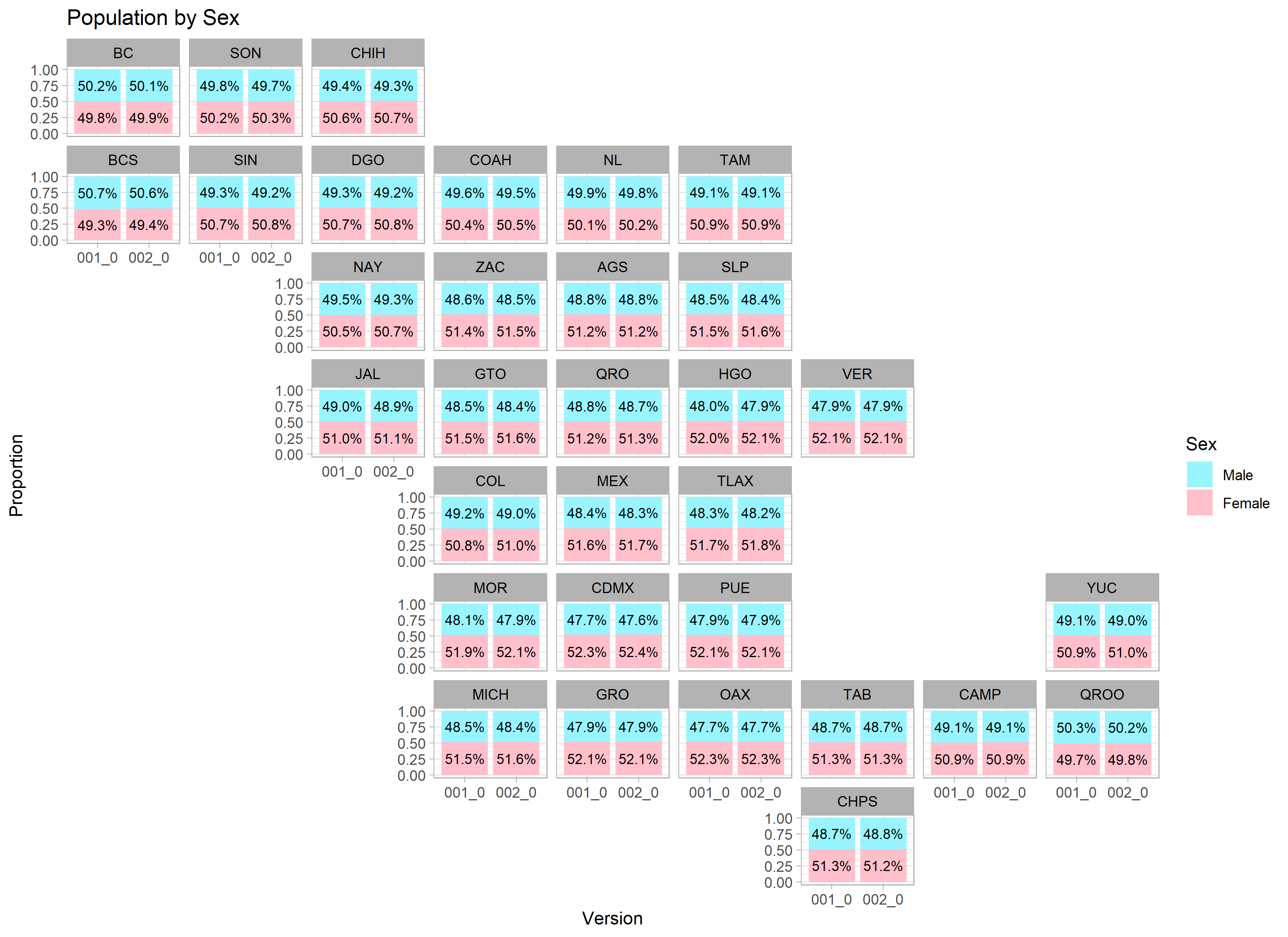
We’re entering our second year of delivering the most accurate and up-to-date demographic estimate for Mexico’s diverse population. Our dataset not only paints a vivid portrait of the nation’s demographic landscape but places an emphasis on multiple factors that highlight the socio-economic dynamics of Mexico. Understanding labor force participation is pivotal  to understanding the country’s workforce trends, gender participation nuances, and regional labor disparities. 

In Mexico, the participation of females in the labor force has traditionally been lower than that of males, a reflection of deep-rooted cultural norms and societal expectations that often prioritize domestic responsibilities for women. While Mexico has made significant strides in recent years to empower women economically, the gap remains notable. This stands in contrast to the United States, where the labor force participation rate of women has steadily approached that of men, particularly since the mid-20th century. Feminist movements, supportive policies like maternity leave, and shifting societal expectations have played crucial roles in this uptrend.

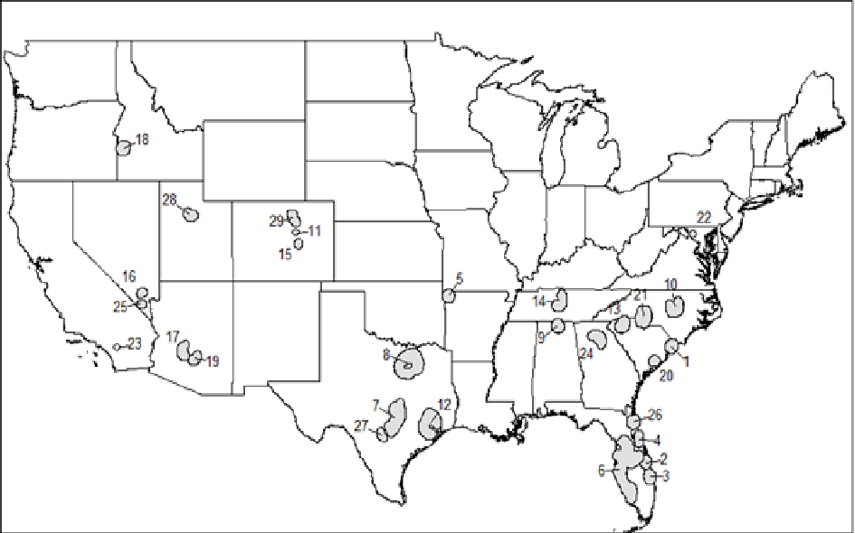
The below images show labor force participation and employment status by gender, by state. 


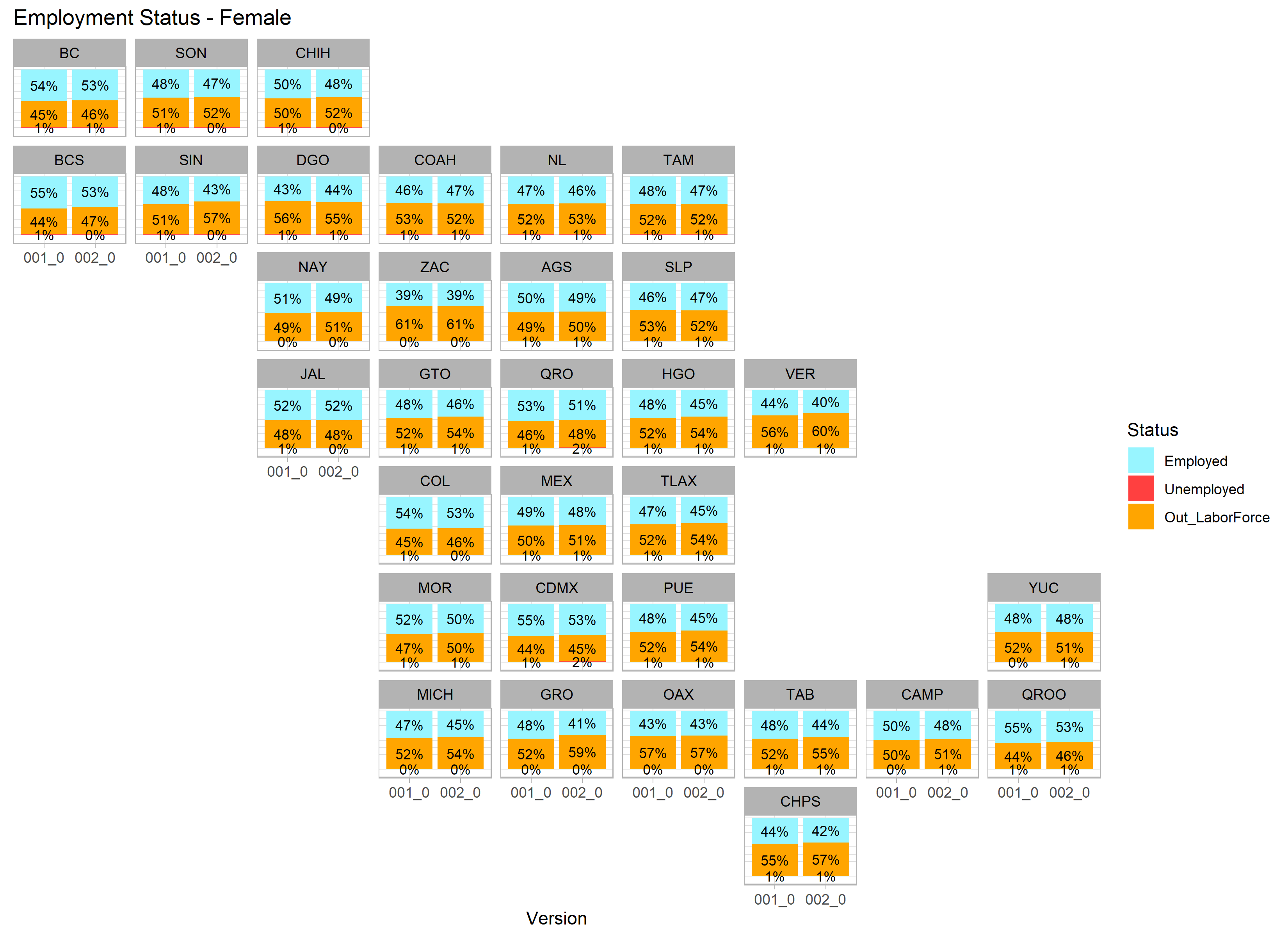
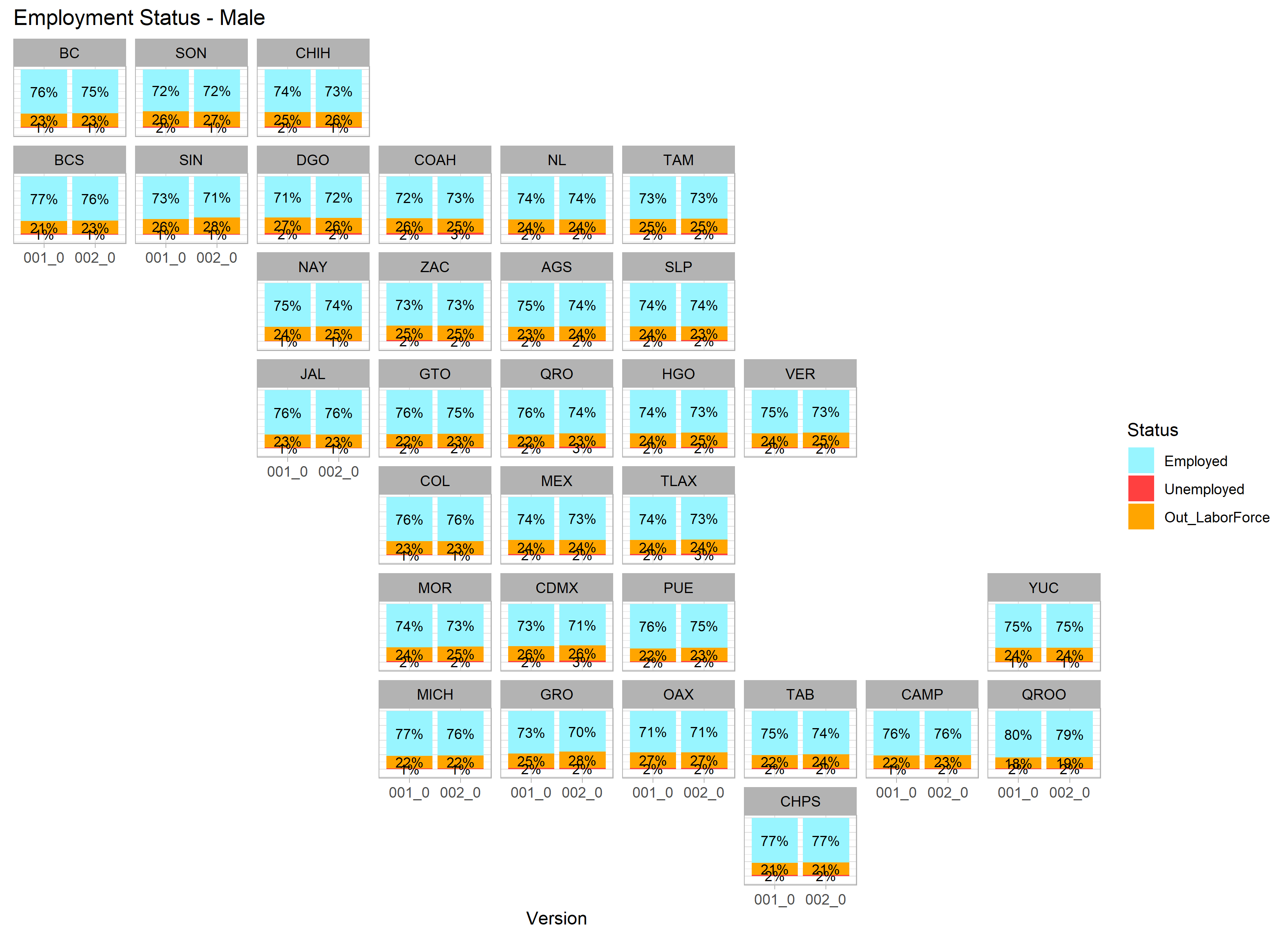
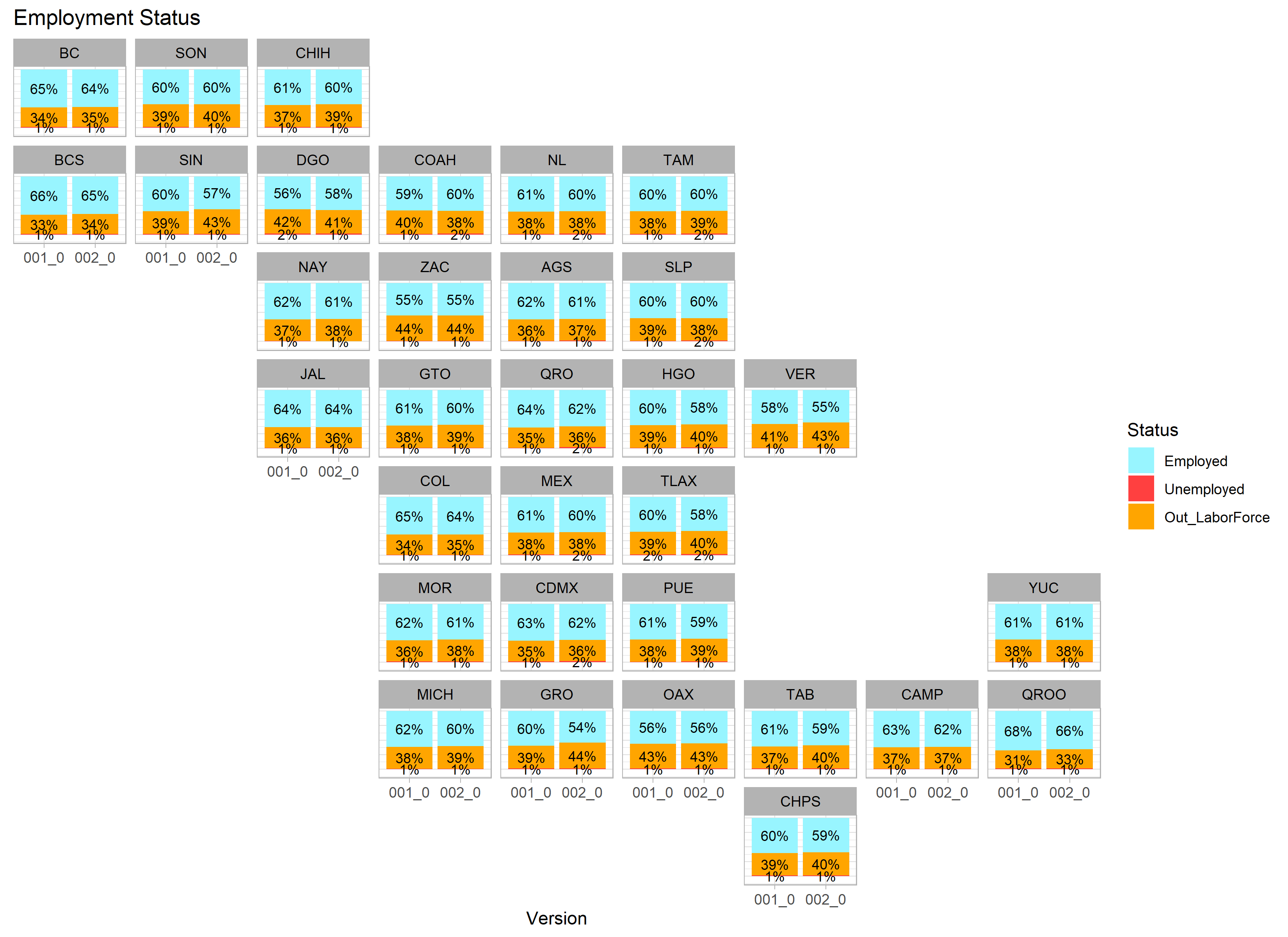
As of July of 2023, the National Occupation and Employment Survey of Mexico, reported a 2.9% unemployment rate on a national level. The survey targets Economically Active persons, who are 15 years or older. There is a slight difference in our reported unemployment rates and their reported rates, due to the fact that we report unemployment considering the entire working population (12+), and they do not due to privacy reasons. 

Drawing a direct comparison, while the United States has been a front-runner in championing women’s rights and their place in the workforce, Mexico’s journey is emblematic of a nation working to reconcile its rich cultural traditions with the evolving demands of a modern economy. The experiences of both nations underline the global imperative to create environments where women are empowered to participate fully and equally in the labor market. Dive into our dataset and equip yourself with the tools to truly understand the heartbeat of Mexico’s population.

Interested in updated US and Mexico population counts?

Get a sample now

Top 29 Market Report – 2023

Exploring the top 29 markets experiencing the most growth in the US.

Top 29 Market Report

Exploring the top 29 markets experiencing the most growth in the US.   

Each year, we create a ranking of high growth markets in the US. The method through which we identify a market is somewhat novel and we believe it allows us to identify growth in a unique way, which is not limited by standard predefined geographies. 

First we lay out our criteria, which looks as follows:

  • Initial market size is at least 60,000.
  • Minimum 2% per annum growth rate.
  • Minimum 8,500 person growth rate.
  • Emphasis on majority growth in the last 2 years.
  • Limit the analysis to the Continental US.

Then we begin drawing 15 mile radius circles and continue this process until the entire US is covered. The resulting polygons with a continuous perimeter of all areas that satisfy this criteria are our qualified markets.


Our results are:

  • Over 146,844 markets created
  • Of the 146,844 (2022 figures in parenthesis), 32,966 (32,808) had a current base population > 60,000
  • 15,347 (20,202) had a per annum growth rate > 2% or
  • 2,056 (2,068) had a per annum pop growth > 8,500
  • Only 1,198 had all three. 
  • Which in turn consolidates to 29 Markets
 

Rankings Criteria

1

Fastest growing area by per annum growth rate for the past two years

2

Fastest growing area by per annum growth rate for the next ten years

3

Fastest growing area by sheer population growth for past two years

4

October 2019 Population Base

5

Average Age (oldest to youngest)

6

Average Income

7

Market Force

We created our own measure of market growth, ‘Market Force’, which contrasts the growth of housing values and population growth. We believe it tells a better story about the market’s strength down to the neighborhood level. 


Market Force – The geometric mean of the growth in home values * growth in population 

((HVcp / HV2007 ) * (PEcp / PE2007 )) ^0.5

 Our top three markets according to their ‘Market Force’ are:

1. Austin/SA Corridor

2. ~Douglas, CO

3. DFW Metro, TX

Check out how they compare on several key indicators:

Economic Vitality


Housing Values


Interested in updated US and Mexico population counts?

Get a sample now

Are We Headed Towards a Demographic Collapse?

The rapid decline in birth rates globally deserves our attention. Let’s explore how the numbers stack up.  

Are We Headed Towards a Demographic Collapse?

The rapid decline in birth rates globally deserves our attention. Let’s explore how the numbers stack up.  

As we move through the 21st century, numerous countries, particularly in the developed world, are experiencing significant declines in birth rates, which threaten to restructure societies in profound and potentially detrimental ways. This phenomenon is particularly pronounced in the United States, where birth rates have seen a sharp drop, a reduction of 6.8% per year in 2022 compared to 2016. Such a demographic shift poses a serious challenge, potentially shaking the foundational structures that underpin nations.

This precipitous decline in birth rates, paired with the simultaneous extension of life expectancy, is resulting in a major shift in the demographic makeup of many societies, with a tilt towards older populations. Economically, this presents a considerable problem: as the proportion of older people increases, so too does the dependency ratio, the ratio of non-working to working age individuals. This imbalance creates immense pressure on younger generations who must shoulder the burden of supporting a larger, older, and non-working population. The social security and healthcare systems are expected to face enormous strains, potentially leading to their insolvency. Additionally, with fewer young people entering the workforce, innovation and economic productivity may stagnate or decline, threatening national and global economic stability.

At the 2023 PopStats Research Conference, Brian Stickland and Dustin Stancil explored the implications of falling birth rates in the US. Their research illuminated a topic that often goes unnoticed despite its pressing significance. The key findings of their presentation are highlighted below.

Fertility Globally

Fertility rates are declining globally. Since 1950, we’ve seen a 50% reduction in the average number of children per woman. Two of the leading factors in this decline are better and more widely adopted contraception methods, and increasing levels of education. This is most evident in countries like Angola, where a female with no education averages 7.8 children and one with a college education averages 2.3.


In developed economies, we can clearly observe how higher life expectancies aren’t the only thing leading to a top heavy age graph. In Italy, birth rates have been declining steadily for the past 70 years. In 1950, the average Italian woman had 5.3 children, but by 2022, that number had fallen to 1.24 children per woman. 


In the US, currently the 0-4 age range is the smallest cohort under 65. 

Generational viewpoint

As we look at the shifting socio-cultural landscape, another way of tracking population growth is to look at it generationally. Brian and Dustin looked at population and the following blocks to see how they compare to one another.


Now a little math to project the eventual size of generation “Alpha”, as they called it, and we observe that even in a best case scenario, we’re confronted with a 7.8M gap compared to the previous generation. In conversation the presenters and attendees discussed how numerous social and cultural factors contribute to the global decline in population growth. Increased access to education and career opportunities for women often results in delayed childbirth or smaller family sizes. Urbanization, bringing with it increased child-rearing costs, further influences decisions on family size. Gender equality norms, societal expectations, and work-life balance policies also significantly affect fertility rates. Additionally, the high cost of childcare, lack of family-friendly work policies, and work-centric societal expectations prevalent in many developed nations contribute to declining birth rates. Finally, shifting values towards individualism and acceptance of non-traditional family structures, including later marriages, increased divorce rates, and child-free lifestyles, have also been associated with lower fertility rates.

Workforce impact 

Looking at the workforce, the presenters estimated a 2M deficit in the labor force in the next 8-16 years.

This reduction in the workforce could have profound economic and societal impacts. The reduction could exacerbate the burden on the working-age population to support an increasingly aged society, straining social security and healthcare systems. It could also lead to labor shortages in critical sectors, driving up wages, and potentially causing inflation. With a smaller labor force, economic growth could stagnate or even decline, impacting living standards. Furthermore, the reduction could impede innovation and technological progress, as these are often driven by young, dynamic participants in the workforce. Lastly, this demographic shift could lead to significant changes in policies, including those related to immigration, retirement age, and work-life balance, as countries strive to mitigate the effects of a shrinking workforce.

Mitigating the effects

 Many countries are proactively trying to tackle these issues. The Italian and Chinese governments, for example, have introduced a number of policies aimed at making it easier for families to have children, such as tax breaks and subsidies for childcare. The governments are also working to improve the quality of life for women, in the hope that this will encourage them to have more children.

 In addition to these measures, the Chinese government is also investing heavily in automation and artificial intelligence. This is in an effort to reduce the country’s reliance on human labor and to make up for the shortfall in the workforce. 

 Immigration can serve as a viable solution to the economic challenges associated with declining birth rates. By supplementing the domestic labor force, immigrants can help maintain productivity levels and sustain economic growth in countries with a falling population. They bring with them a diversity of skills and talents, often filling labor gaps in various sectors. Moreover, a younger immigrant workforce can help balance the dependency ratio by supporting aging populations, thereby relieving some pressure off social security and healthcare systems. However, while immigration may benefit the receiving countries, it could also create challenges for the countries of origin. This phenomenon, often referred to as “brain drain,” can lead to a scarcity of skilled labor in these countries, hampering their development. Furthermore, it can exacerbate demographic imbalances if younger, working-age individuals are the ones predominantly leaving, thereby accelerating population aging in those countries. It’s therefore crucial for immigration policies to be considerate of both the source and destination countries’ needs to ensure sustainable global development.

 It is too early to forecast the full impact of the measures being adopted by governments around the world, but our hope is that their policies can catch up to the current state of the world and even get ahead of what is coming. 

Interested in updated US and Mexico population counts?

Get a sample now

Average Home Values Since 2007

How has the housing market performed since the 2007 financial crisis?

Average Home Values Since 2007

How has the housing market performed since the 2007 financial crisis?

The US economy has come a long way since the 2007-2008 financial crisis. State and local economies across the country faced their own unique crises dealing with the housing market collapse. We took a look at STI: PopStats™ numbers to see what other economic factors were affected by the collapse and how they’ve changed since then.

The Housing Market

The subprime mortgage crisis of 2007, was a key contributor to the global financial crisis that followed. Property values across the country hit rock bottom. But not everywhere.

We took a look at PopStats data since 2007 and it clearly shows that some areas were hit harder than others. Some states’ housing markets hardly skipped a beat like Texas, North Dakota, Colorado, etc. While others took it much harder than others like West Virginia, Michigan, etc. See for yourself in this graphic:

Here’s another view of the data:

The following videos are visualizing population density (height) and average home value (color) by county. Each video shows a different view of the United States starting with the west, then central, and finally the east. Both average home value and population density have limits. The data is from Q1 of each year. 

Some interesting locations to look at are Austin, Texas (Travis County), Southern Florida, and Minneapolis, Minnesota (Hennepin County).

WEST VIEW 2007-2021

CENTRAL VIEW 2007-2021

EAST VIEW 2007-2021

Taking A Closer Look

As we look at the communities under our scope, we’ll refrain from deriving conclusions as to the exact causes for the observed outcomes. Our expertise lies in generating accurate forecasts and estimates, not in providing this type of analysis, so we’ll leave it up to the reader to infer deeper insights. 

The first market we’ll focus on is Austin. It has experienced unprecedented growth in almost every category. The next market we’ll showcase is Phoenix, which took a hard hit at the beginning of the recession, but has experienced a strong recovery. Lastly, we’ll look at Charleston, West Virginia, which didn’t move much at all during the entire 14 year period. 

The Markets

Our approach to evaluating these three markets will be to explore their population, unemployment, housing, and GDP in 2007, 2012, 2016, and current-day (Q3 2021).

Austin 

In 2007, the Austin market’s population was 1,412,264. At the same time, the city’s unemployment rate was 3.49%, the average home value was $202,964, and GDP running at $70,379.

Austin’s population has exploded over the past 14 years. It’s worth noting that unemployment has increased by 36% when compared to 2007, but unemployment increases many times are a sign of mobility and opportunity for job seekers.

Today, the difference for the highlighted fields is as follows:

    • Population: +58% 
    • Unemployment: +36%
    • Average Home Value: +169%
    • GDP: +5.2%

Phoenix

In 2007, the Phoenix market’s population was 3,830,898. At the same time, the city’s unemployment rate was 3.34%, the average home value was $360,952, and GDP running at $60,043.

An interesting insight to make about the data listed below is that Phoenix’s housing market was 78% more expensive than Austin’s in 2007. Then the Phoenix market appears to correct into 2012 where the two markets then became comparable. Going forward from 2012, both markets behave similarly. 

Today, the difference for the highlighted fields is as follows:

    • Population: +31% 
    • Unemployment: +99%
    • Average Home Value: +70%
    • GDP: -4.33%

Charleston, WV

In 2007, the Charleston market’s population was 224,942. At the same time, the city’s unemployment rate was 4.17%, the average home value was $121,385, and GDP running at $51,503.

What’s most interesting about the Charleston, WV market, and why we chose to highlight it, is Charleston has a population decline. The only one with a population decline of the three markets we’ve highlighted. This market’s GDP still increased since 2007 despite a population decline. 

Today, the difference for the highlighted fields is as follows:

    • Population: -4.3% 
    • Unemployment: +30%
    • Average Home Value: +25%
    • GDP: +7.5%

Conclusion

When we look at the data for 2007, 2012, 2016, and 2021, we see more nuance as to how each market traversed the challenges it faced. Below is a spreadsheet with the variables we measured, listed by year:

Looking back at the past 14 years, we lived through a crisis that shook the foundation of our economy and begged the question as to whether the American dream of home ownership can remain accessible to all. Since then, many socio-political changes have taken place and we’ve seen the country bounce back and achieve record breaking levels of economic growth. For the past two years, we’ve been living through a global pandemic that has challenged every country in the world, and changed the way Americans view their work, and standard of living. The net effect of these massive changes are yet to be fully realized and quantified, but as always, our data will provide a clearer view of the past so we can better project the future.

Does your data prepare you for the ups AND downs?

get the data

Economic Development in Top Growth Markets

GDP per capita in top growth markets is either slowly increasing, or not at all.

Economic Development in Top Growth Markets

GDP per capita in top growth markets is either slowly increasing, or not at all.

As shocking as it may sound, only 2 of the 5 top growth markets in the United States have a higher GDP per capita now than they did in 2007 after adjusting for inflation. Take a look at these 5 markets and how they compare to their states and the nation.

Running the Numbers

We derived this insight by tracking  GDP per capita using our GDP and population fields from 2007 to 2021. We then adjusted these numbers for inflation, based on BEA data, to create an accurate view of how these markets are progressing. The graph below shows how each market stacks up against each other, their states, and the nation (y-axis is in thousands):

gdp per capita adjusted for inflation line graph

There are several different ways GDP can be measured. Our GDP estimates are a GDI (Gross Domestic Income). This allows us to create estimates at a local level and is equivalent to GDP on larger levels. The following four incomes are considered: farm income, personal income, business income, and government income (taxes).

Diving Deeper

If you take a look at the spreadsheet above, the last column reveals that only one market (Charleston) has had a substantial amount of GDP per capita growth that also beat the nation. Two markets, Myrtle Beach and Phoenix, exhibited a decline in GDP per capita, and Boise is hardly displaying an increase. Two economic crashes occurring within the last 14 years are likely large contributing factors to these trends.

The inference that can be made is that the populations moving to these markets add a lower amount of per capita output than the starting per capita output level.

The October release for the July 2021 estimates is available now!

Learn More About PopStats

LandScape Segments Fueling Top Growth Markets

Let’s explore the groups responsible for driving economic vitality in the top growth markets in the United States

LandScape Segments Fueling Top Growth Markets

Let’s explore the groups responsible for driving economic vitality in the top growth markets in the United States

Earlier in 2021, we released our “Top Growth Markets” annual report. This report lists the 26 strongest markets in the United States. In those markets, there are segments of the population that are fueling this growth. We dive into the top 10 markets and determine which segments are responsible for their growth.

What are STI: LandScape™ segments?

STI: Landscape™ is a lifestyle segmentation product that allows a marketer to identify their customer profile from 72 predetermined segments and to pinpoint their location across the U.S. All 72 segments are sorted into 15 categories. Lifestyle segments are determined by race, household type, age, income, and many other factors. Knowing customers’ unique lifestyle attitudes has numerous applications including site selection, marketing, merchandising, and so on. 

Knowing what type of customer is in a market, and which ones are growing in an area, is a valuable insight into any untapped potential.

Segments Fueling the Top Markets

In the top 10 of the top markets report, there were a few segments that stood out. The first one was the Sitting Pretty segment. This segment appeared 6 times out of the 50 chances it got. The Sitting Pretty segment falls under our Urban Cliff Climbers category which are high-density neighborhoods that are mostly filled with families that work hard for their well-earned living. They’re a strong representation of the “working class.” 

The segment that had the second-highest number of appearances is the Sublime Suburbia segment which appeared 5 times. This segment falls under the Married in the Suburbs category which includes 30-something suburbanites enjoying the fruits of the high-quality suburban lifestyles. They earn very good incomes and they mostly consist of married couples with children.

The segment with the third-highest, and our final segment spotlight, is the Legacy Years segment which appeared 4 times. Legacy years falls under the Specialties category in LandScape which are unique segments that don’t quite fit any other category. These neighborhoods generally host people that range in age of older 50s to early 60s.

As you follow along with the list, use this guide to help you better understand what type of neighborhoods are helping these markets grow. You can also click on each segment to get a more detailed definition. Reach out on the chat or here for detailed descriptions of all 72 segments.

The Segments:

Austin, TX – The highest growth market from the 2021 report is Austin! The area referenced in the report comprises Travis, Hays, and Williamson counties.

The segments fueling the Austin growth are ranked as follows:

  1. Sitting Pretty
  2. Land Barons
  3. Los Solteros
  4. Los Padres
  5. Pastoral Vistas

Boise, ID – coming up second in the fastest-growing markets is Boise! The counties encompassing this market are Ada, Boise, Payette, and Canyon county.

The segments fueling the Boise market are:

  1. Kindred Spirit 
  2. Sitting Pretty 
  3. Couples with Capital 
  4. White-Collar Status 
  5. Sublime Suburbia
Myrtle Beach, SC – still remaining in the top 5 fastest growing markets is the vacation spot, Myrtle Beach. This market includes Horry county.
 
The segments fueling the Myrtle Beach market are:
  1. Sitting Pretty
  2. Legacy Years
  3. Doublewides
  4. Pastoral Vistas
  5. Sublime Suburbia

Charleston, SC – the second market in South Carolina claiming its spot on this list is Charleston. The counties included in this market are Charleston, Dorchester, and Colleton county.

The segments fueling the Charleston market are:

  1. Sublime Suburbia
  2. Great Generations
  3. Couples with Capital
  4. Regents
  5. Hard Hats and Hair Nets

Phoenix, AZ – In the middle of a desert climate is the growing Phoenix market. The market includes Maricopa county.

The segments fueling the Phoenix market are: 

  1. Sitting Pretty
  2. Educated Earners
  3. Los Trabajadores
  4. American Knights
  5. Los Solteros

Lee, FL – Southwest Florida is experiencing healthy growth along the coast from tourism and industry. This market is only comprised of Lee county.

The segments fueling the Lee market are:

  1. Golden Heritage
  2. Hard Hats and Hair Nets
  3. Legacy Years
  4. Stately Suburbs
  5. Suburban Singles

Orlando, FL – Central Florida claims a second spot for the sunshine state in our fastest top growth markets. The counties included in this market are Orange, Sumter, Lake, Marion, and Hernando county.

The segments fueling the Orlando market are: 

  1. Great Generations
  2. Sublime Suburbia
  3. Golden Heritage
  4. Legacy Years
  5. Gainfully Employed

Northwest Pinal, AZ – Arizona received rapid growth in its markets this past year. The only county considered in this market is Pinal County.

The segments fueling this market are:

  1. Kindred Spirits
  2. White-Collar Status
  3. Hard Hats and Hair Nets
  4. Sitting Pretty
  5. Legacy Years

North Dallas/Fort Worth, TX – The DFW metropolitan area is the 4th largest metro area in the United States. Even with that status, the more northern area of the metro is experiencing some of the biggest growth in the country. The counties included in this market are Denton, Collin, Hunt, and Rockwall.

The segments fueling this market are:

  1. American Knights
  2. Sitting Pretty
  3. Great Generations
  4. Country Villas
  5. Sublime Suburbia

South Nashville – The last top growth market to be discussed will be the southern part of Nashville. The county included in this market is Davidson county.

The segments fueling this market are:

  1. Standing Tall
  2. Apprentices
  3. Still Standing
  4. Hard Act to Follow
  5. Suburban Singles

Want to know the definition of all the 72 segments?

Get the LandScape Data Dictionary

4 of the 5 Most Active Grocery Retailers are PopStats Customers

Here’s why.

4 of the 5 Most Active Grocery Retailers are PopStats Customers

Here’s why.

“Click and Carry” (pickup) is fueling e-commerce for grocery retailers across the nation. This new trend isn’t showing any sign of slowing down, but the fight for the perfect store location is still being fought. 

BuildCentral recently released an article listing 2021’s Top 5 Most Active  Grocery Retailers in America. It dives into the topic that regardless of the digital age, grocery stores are still ramping up construction of their brick and mortar stores.

Out of the 5 grocers listed in the article, 4 trust STI: PopStats™ to power their market strategy and site-location decisions.  These top grocers use PopStats because it is the most up-to-date and accurate geospatial dataset on the market.  

This article will dive into the different reasons why they choose PopStats and other Synergos datasets again and again.

Want a free sample of PopStats? Contact us today!

Get A Free Sample

“By applying variables from PopStats, like income, age, and ethnicity, to our analysis, we can do that, even at lower geographic levels — and with extreme confidence.”
“…with PopStats we’ve found that the data stays consistent and the error rate stays small. This is important to us because the more accurate the data is, the better informed our decisions are.”

Here at Synergos Technologies, we work under a policy we call, “ACT.” 

  • A – Accuracy
  • C – Comprehensive
  • T – Timely

Everything we create and do must fall under these three pillars. They help us to create quality products and services that maintain our status as industry leaders. Let’s dive into how our full data suite falls into these pillars. 

Accuracy

Many PopStats customers use our datasets due to their accuracy and dependability. Those attributes come from proven methodologies that allow you to make confident decisions. 

There are many different ways are able to check data quality and ensure accuracy in every release. One way is through a “Q&A” process. This is a robust process that involves testing the final product with proprietary procedures before we release the product. We are also constantly creating maps and graphs to see if we can catch any data discrepancies (we like to post our most interesting discoveries online).

Another way we prove the effectiveness of our methodologies is by comparing our estimates to Census and ACS numbers. Our Accuracy whitepaper shows the numbers and how close our population estimates were to the 2010 census.  PopStats counted 99.998% of the United States population. Fast forward 10 years to the 2020 census and PopStats counts 99.993% of the population. That’s 20+ years of exceptional accuracy that our competitors aren’t able to achieve.

Out of anyone else in the industry and our competitors. Our estimates were the closest to the Census results. We were even closer than the Census’s own preliminary estimate.

Comprehensive

Comprehensive to us means that we have so many unique, accurate, and updated variables, that you will be able to extensively understand your site-selection research. A few unique variables we create are religion, discretionary income, and economic variables like GDP and mortgage risk. PopStats has the largest selection of fields in a single demographic product (over a thousand), and we update it quarterly.

Moving along, every variable in our datasets is backed by trusted and official sources. Most use more than one source! Some sources that our datasets use are:

You can contact us if you’re interested in learning about our full list of data sources.
 
We then use proprietary mathematic models to shape the data into estimates. All of these steps create robust datasets that can be used to effectively make decisions beyond site location like what items to stock on the shelves or what kind of advertising would be effective in an area. The opportunities are endless.
 

Timely

Uniquely, in the realm of demographic estimates, PopStats is the first and only dataset to be released quarterly. No other data provider can duplicate that process a the level of accuracy we do it at. The struggle with that is on-time releases. Synergos Technologies is proud to say that of our 25+ years in business we have never been late on a PopStats delivery. We understand our customers are working diligently to find the best sites for their new store locations. That’s why we also work diligently to make sure they have the tools they require when they need them.

Another factor in our reliability is our industry-leading customer service. Being able to pick up the phone and talk to a person immediately is a thing of the past for most businesses. Not with us. We always have someone at the phone ready to answer questions immediately during business hours. Additionally, we have created multiple points of access to our customer service like email and our new website chatbox. Our excellent system allows us to be proud to say that all customer inquiries are answered within a day of contact, and often within the hour. 

Interested in learning more? Contact us today!

Learn More About PopStats

– Extra Material –

The Most Livable Counties – A Discretionary Income Analysis

Consumer spending habits and discretionary income determine the quality of life for many Americans. Which counties are experiencing the best?

The Most Livable Counties – A Discretionary Income Analysis

Consumer spending habits and discretionary income determine the quality of life for many Americans. Which counties are experiencing the best?

America is beginning to return to a more normal state of living. Now that the COVID-19 pandemic is seemingly coming to an end, consumer spending is beginning to increase again. We used STI: PopStats™ data to analyze average household incomes and discretionary incomes to determine where the most livable cities/areas across the country are, and to see where spending is likely to increase the most. 

The ranking for the following cities/areas was determined by comparing average discretionary income versus the average household income in a county. The counties with the most discretionary income to spend on goods not considered necessities are ranked higher. With consumer spending ramping back up in America, the areas with more discretionary income will be spending more than others. 

Along with our rankings, we included economic indicators unique to the PopStats product like ‘Gross Domestic Product’ and ‘Mortgage Risk.’ These unique variables give further insight into our clients’ potential customers and their custom customer profiles. Mortgage risk is an interesting variable in that it rates an area on its chances of defaulting on a mortgage from 1 to 5, 5 being most likely and 1 being least likely.

All numbers and figures used in this analysis are sourced from STI: PopStats™. Contact Us to learn more about the 1000’s of variables we update quarterly.

Most Livable Counties in the United States

10. Nassau County – Long Island Area

  • Population: 1,356,138
  • Average HH Income: $157,016
  • Average Discretionary  Income: $65,977
  • GDP per Capita: $111,661
  • Mortgage Risk: 3.2672
  • Average Disposable Income: $107,841

This county is the first county outside of New York City. A theme that you are going to notice through the rest of this analysis is that “most livable cities” are actually areas right outside of thriving metropolitans. These professionals are benefitting from high salaries and then escaping back to more affordable real estate. This combo allows for more discretionary income worth the extra time spent in the car.

9. Philadelphia – Chester County

  • Population: 533,178
  • Average HH Income: $139,215
  • Average Discretionary Income: $66,893
  • GDP per Capita: $91,027
  • Mortgage Risk: 2.7338
  • Average Disposable Income: $99,520

With a population of over 500,000, Chester county hosts several cities that are reaping the benefits of having a manageable drive time to Philadelphia. 

8. The Bay Area

  • Population: 3,816,251
  • Average HH Income: $177,761
  • Average Discretionary Income: $67,454
  • GDP per Capita: $148,538
  • Mortgage Risk: 3.9355
  • Average Disposable Income: $118,504

Several counties in the bay area made the cut. This analysis is comprised of the following counties: Marin, San Mateo, Santa Clara, San Francisco.

It’s not a common thought to think of the bay area as livable with their housing crisis and homeless problem the area faces; however, looking at the data shows that those employed (especially in the booming tech industry) are able to fully utilize everything the area has to offer.  

The bay area has the highest average household income on the list as well as the highest GDP per capita. The affordability of the city plays a heavy role with the fact that this area has the highest difference between income and discretionary income. 

7. Indianapolis – Hamilton County

  • Population: 353,562
  • Average HH Income: $134,750
  • Average Discretionary Income: $68,669
  • GDP per Capita: $81,691
  • Mortgage Risk: 2.7086
  • Average Disposable Income: $97,894

Hamilton County is what you can consider a “healthy economy.” Their economic vitality score places them right on par with the national average. This along with high spending potential make it a solid area to live. 

6. Forsyth County, GA

  • Population: 253,007
  • Average HH Income: $130,218
  • Average Discretionary Income: $69,663
  • GDP per Capita: $81,203
  • Mortgage Risk: 3.0771
  • Average Disposable Income: $100,934

Although this is the most rural county on our list, their incomes and spending power allow them to put up a good fight. Forsyth County has the highest economic vitality index on the list but the lowest GDP per capita. 

5. New Jersey (New York Suburbs)

  • Population: 824,369
  • Average HH Income: $157,070
  • Average Discretionary Income: $69,707
  • GDP per Capita: $106,938
  • Mortgage Risk: 2.8996
  • Average Disposable Income: $108,721

This is another area with several counties making this top cities list. The counties included are Morris and Somerset.

A commute from a Jersey town to the bustling island of Manhattan is a pop culture reference at this point. With their close proximity to high incomes and the availability of more affordable real estate, it’s not hard to believe these counties host some of the most livable cities. 

4. Baltimore – Howard County

  • Population: 330,939
  • Average HH Income: $151,890
  • Average Discretionary Income: $71,558
  • GDP per Capita: $90,908
  • Mortgage Risk: 3.2304
  • Average Disposable Income: $110,736

This county has an advantage that no other county on this list has. This county is sandwiched between two major metropolitan cities (Baltimore being the closest). The residents of this county get to benefit from both Washington D.C. and Baltimore.

3. Washington D.C. – Loudoun and Fairfax County

  • Population: 1,556,521
  • Average HH Income: $164,066
  • Average Discretionary Income: $73,537
  • GDP per Capita: $92,160
  • Mortgage Risk: 3.4726
  • Average Disposable Income: $116,647

The capitol city is hosting quite a few different neighboring counties on this list. Loudoun and Fairfax are benefitting from the city the most. These counties are enjoying healthy economies. The discretionary incomes in these areas are mirroring some people’s entire income. 

2. Denver – Douglas County

  • Population: 367,726
  • Average HH Income: $150,232
  • Average Discretionary Income: $74,097
  • GDP per Capita: $81,981
  • Mortgage Risk :3.4863
  • Average Disposable Income: $110,941

For a city of its size, Denver has a relatively high cost of living. That does come with some great salaries. The neighboring counties, like Douglas, are the ones taking the most advantage of that. 

The most livable county in America:

1. Nashville – Williamson County

  • Population: 250,620
  • Average HH Income: $153,023
  • Average Discretionary Income: $78,515
  • GDP per Capita: $98,173
  • Mortgage Risk: 3.2665
  • Average Disposable Income: $112,789

Austin didn’t make the top 10 in a city list? Not this time. A Nashville county currently holds the rank as the most livable city in America according to our discretionary income data. Between the cost of living and the cost of real estate in Tennessee, residents are able to afford to shop and spend lavishly. 

scatter plot of the top 10 liveable counties

Everyone’s definition of the most livable city/county will be different. Spending on necessities takes a large portion of our annual salaries. The money that is left over is what we can spend on pleasantries and entertainment like vacations, luxury goods, gifts, etc. Having the ability to spend on activities and goods like that are what make cities livable and popular. 

Using variables like discretionary income and comparing them to staple variables like household income and mortgage risk can make for effective customer profiles and city stories. Combining different datasets and cross analyzing data is how you make effective and profitable site-location and related decisions. 

STI: PopStats and STI: Spending Patterns made this analysis possible. Contact us to learn how you can put our data to work for you.

Put Data into Action

The Highest Home Values in Texas

In a market this hot, which county is the hottest?

The Highest Home Values in Texas

In a market this hot, which county is the hottest?

Being that Texas is as large as it is, the lone star state’s home values can vary vastly across the market. According to PopStats data, the average Texas home value in January 2021 was $280,816. Some counties blow that number out of the water. Let’s take a closer look at the top 10 counties with the highest home values. 

All numbers and figures used were created using STI: PopStats™ data. Contact us to learn about the thousands of other variables we update quarterly. 

Top 10 Counties With the Highest Home Values

10. Bexar County (Primarily San Antonio) 

san antonio river walk

Population: 2,063,682

2021 Average Home Value:  $248,578
2020 Average Home Value:  $238,003

Average Household Income: $82,607

San Antonio is the major city for Bexar County and sits at number 10 on our list for home values. The counties that are listed higher are counties of the 3 other major cities of Texas, and the counties that make up their suburbs. San Antonio just so happens to also rank number 10 in Texas counties for average household income.

9. Harris County (Primarily Houston)

Population: 4,720,553

2021 Average Home Value:  $294,658
2020 Average Home Value:  $285,051

Average Household Income: $96,504

Harris County is a massive county in that it encompasses all of Houston (the 4th most populous city in the United States) as well as a few of Houston’s suburbs including Katy, Baytown, Friendswood, etc. The size of Harris County attributes to its status as the most populated county in the state, as well as the 3rd most populated county in all of the United States. 

8. Dallas County (Primarily Dallas)

Population: 2,617,867

2021 Average Home Value:  $344,135
2020 Average Home Value:  $332,705

Average Household Income: $94,526

Dallas County is self-explanatory in its name. Although Dallas ranks in the top 10 of Texas counties in home values, its suburbs dominate several rankings in this category. 

7. Tarrant County (Primarily Fort Worth)

Population: 2,111,344

2021 Average Home Value:  $300,664
2020 Average Home Value:  $289,162

Average Household Income: $96,056

People living in Dallas County (more specifically Dallas) may be living there for the amenities that larger cities offer like job opportunities, nightlife, entertainment, etc.  Within the same metro, although smaller and not as vast, is another large city that offers similar amenities – Fort Worth. Ranking 7 in our list, people living in Tarrant county can experience similar amenities, as well as higher home values and better household incomes. 

6. Montgomery County (Houston Suburb)

Image Source: zippsliquor.com/break-room/upcoming-summer-events-in-conroe/

Population: 630,248

2021 Average Home Value:  $338,042
2020 Average Home Value:  $327,020

Average Household Income: $117,377

Our first suburb on the list and it’s one that sits right outside of the massive city that is Houston, Texas. This county is bliss suburbia in that it enjoys having close access to city amenities like incomes, jobs, and entertainment, while also maintaining a healthy housing market.

5. Fort Bend County (Houston Suburb)

Image Source: https://www.visitsugarlandtx.com/blog/post/7-ways-to-enjoy-an-awesome-weekend-in-sugar-land/

Population: 839,981

2021 Average Home Value:  $339,863
2020 Average Home Value:  $328,781

Average Household Income: $127,003

Another Houston suburb making the list, but this time in the southwestern part of the Houston metro. Fort Bend County only offers slightly higher home values than Montgomery County but boasts a significant higher population. 

4. Williamson County (Austin Suburb)

Image Source: https://visit.georgetown.org/

Population: 635,242

2021 Average Home Value:  $390,100
2020 Average Home Value:  $365,462

Average Household Income: $110,183

Our first mention of Austin on this list and it’s one of the suburb counties. This county’s home values are rising even faster than Austin’s! But only barely. With a 1 year change of 6.7416% increase over last year, Williamson County is doubling the national average in rising home values. 

So far, we have mentioned most of the major counties in Texas and a few of their suburbs. With only 3 left in our top 10, keep reading to find out which counties have the highest home values in the state of Texas.

3. Denton County (Dallas Suburb)

Population: 924,022

2021 Average Home Value:  $396,122
2020 Average Home Value:  $382,967

Average Household Income: $117,656

Our first Dallas suburb hitting the list enjoying similar benefits as Houston’s suburbs. With an average drive time of 45 minutes to get to downtown Dallas, living in Denton is very advantageous for a variety of different households.

2. Collin County (Dallas Suburb)

Image Source: http://www.discovercollincounty.com/mckinney-texas/

Population: 1,072,393

2021 Average Home Value:  $437,460
2020 Average Home Value:  $422,931

Average Household Income: $117,656

2 of the 3 counties in Texas with the highest home values are both Dallas suburbs. It makes sense with how the DFW metropolitan area offers numerous job and travel options to many industries.  

The Texas county with the highest home values is: 

1. Travis County (Primarily Austin)

Population: 1,329,463

2021 Average Home Value:  $536,117
2020 Average Home Value:  $502,257

Average Household Income: $116,445

Out of every county in Texas, Travis County has the highest home values out of all of them! They aren’t just the highest, they’re all growing at an exceptional rate. The Travis County market is growing 78% faster than the national average. Many factors are contributing to this like a booming tech industry, a large number of entertainment jobs, and they are consistently making it on our annual top growth markets report.

Travis is the only major county to beat its metro counties, and it beats them in both home values and income. Travis County is the county to look at in Texas for growth and innovation. 

Curious about other markets across the country? Contact us now for a free sample!

Get A Free Sample

A Migrating Population

Using IRS Data to Track Movement Patterns during Covid-19

A Migrating Population

Using IRS Data to Track Movement Patterns

Understanding the ebb and flow of where people move across the country is crucial to making critical site location decisions. That is why we utilized the latest available IRS data to determine where and from people are moving. We are also able to determine average household income from aggregate income data to understand where higher incomes are moving. The need for past migration trends is more important now more than ever, and something we have commonly been asked about in regards to the COVID-19 pandemic.

Here’s an example:

Map of new york outflow migration

Check out the downloads below to view our full library of data visualizations showcasing population migration impacted by COVID-19: 

  • There are 3 sets of downloads. File names are based on FIPS code:
    • Set 1 “OutMigbyState.zip” – includes maps for the 50 states (and DC) and shows the out-migration from the state in question. (51 maps, 48mb) (Download)
    • Set 2 “InMig_County.zip” – has county-level maps visualizing inflow for all counties with at least 100 counties of origin(there are 109 counties that fit that criteria). (108 maps, 72mb) (Download)
    • Set 3 “InMig_OutST_County.zip” shows the same as previous but excludes those counties in the same state. (108 maps, 72mb) (Download)
    • (Download All) (267 maps, 192mb total)
  • Reading the maps:
    • Height represents the number of IRS exemptions with a 99.5 percentile cut off to remove outliers.
    • Color represents income with a limit of $200,000 annual household income. Red represents the destination county.

Interested in other reports? Send us a message and we’ll whip something up for you!

Contact Us