STI: PopStats™ April & July 2020 COVID-19 Related Impacts
Different data points on how COVID-19 has affected the United States
STI: PopStats™ April & July 2020 COVID-19 Related Impacts
Different data points on how COVID-19 has affected the United States
The COVID-19 Pandemic has had a large effect on the daily lives of Americans, as well as causing substantial disruption to the US economy. Many of our clients, especially those across the retail, grocery, and real-estate investment industries are attempting to quantify those effects on their operations. We hope the following maps help illustrate the demographic and economic factors and their impact on the April & July 2020 PopStats Estimates, July and October Releases. As we discuss these estimates it is important to remember that our estimates are point in time, and the estimates for April and July are April 1st and July 1st estimates, respectively.
Most Immediate Impacts – Economic
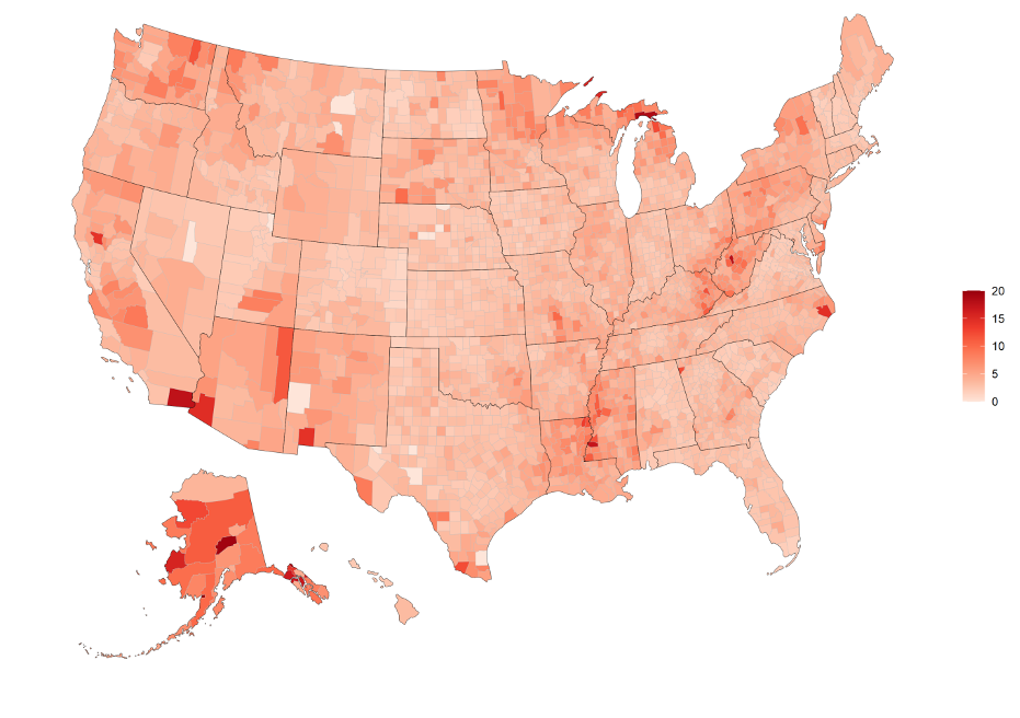
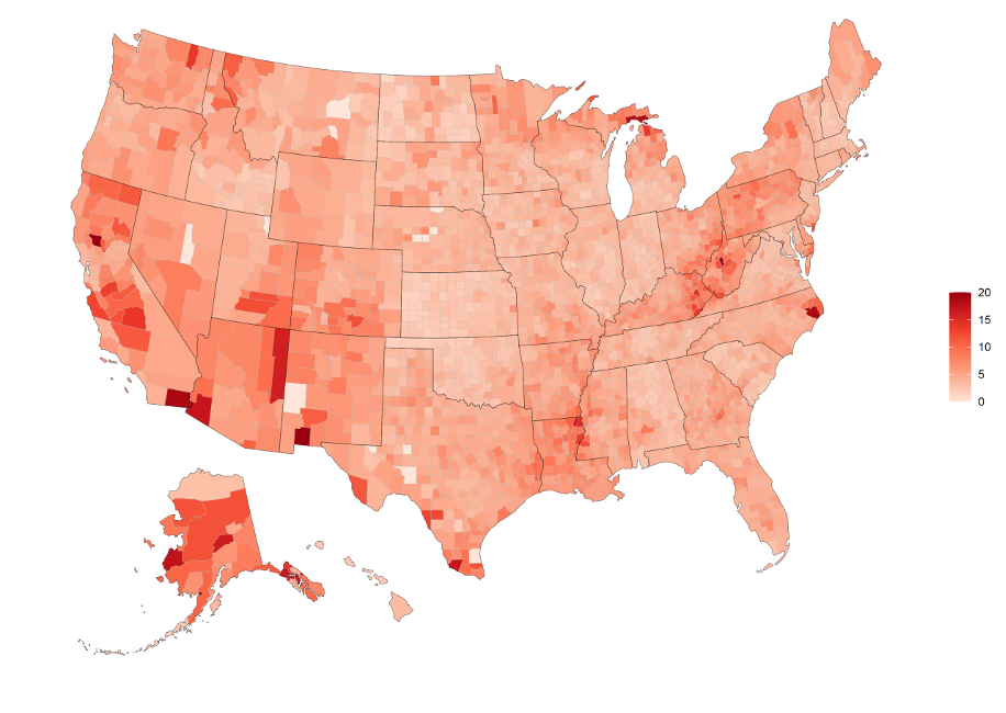
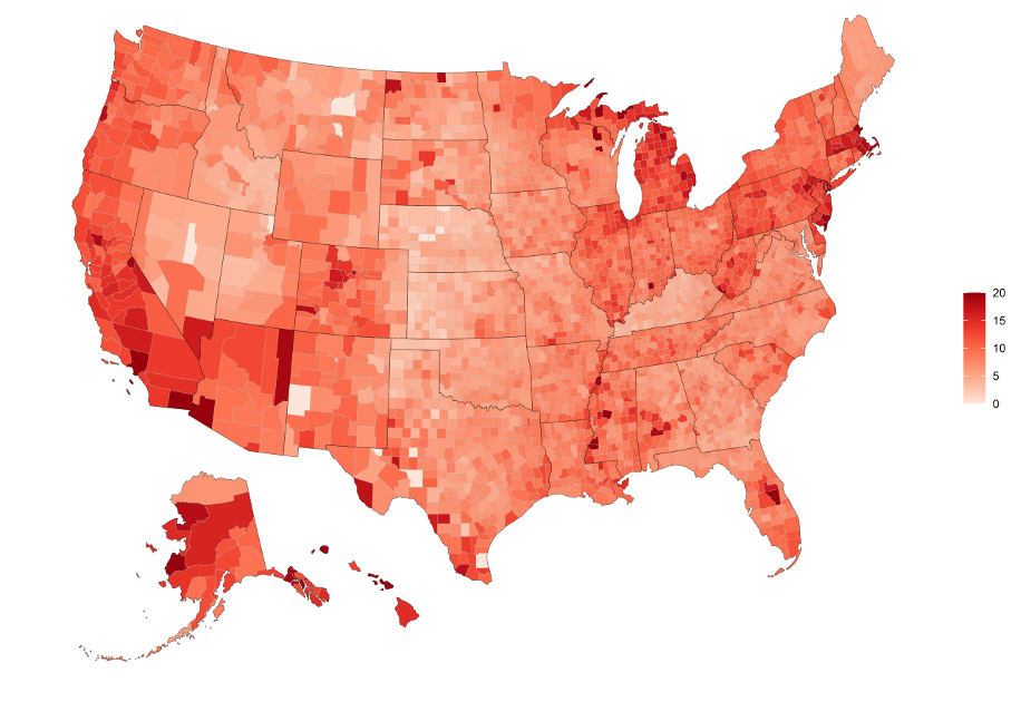
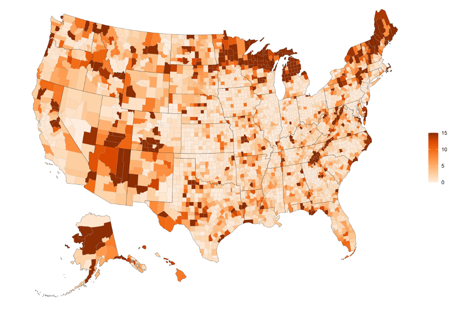
– Unemployment increased nationally by about 1% in April and 7% by July. The following are the Unemployment rates as of the 1st of January, April, and July mapped at a county level.
Unemployment Rate by County as of January 1st 2020, 20% limit
Unemployment Rate by County as of April 1st 2020, 20% limit
- Unemployment Rate by County as of July 1st 2020, 20% limit
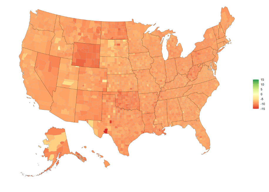
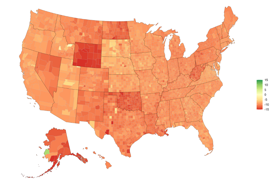
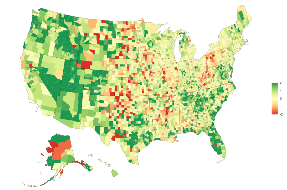
GDP started to dip in April but was more clearly evident with a ~10% national drop in July.
Percentage Change in GDP by County from April 1st 2020 to July 1st 2020, limits of -15% to 15%
Percentage Change in GDP by County from January 1st 2020 to July 1st 2020, limits of -15% to 15
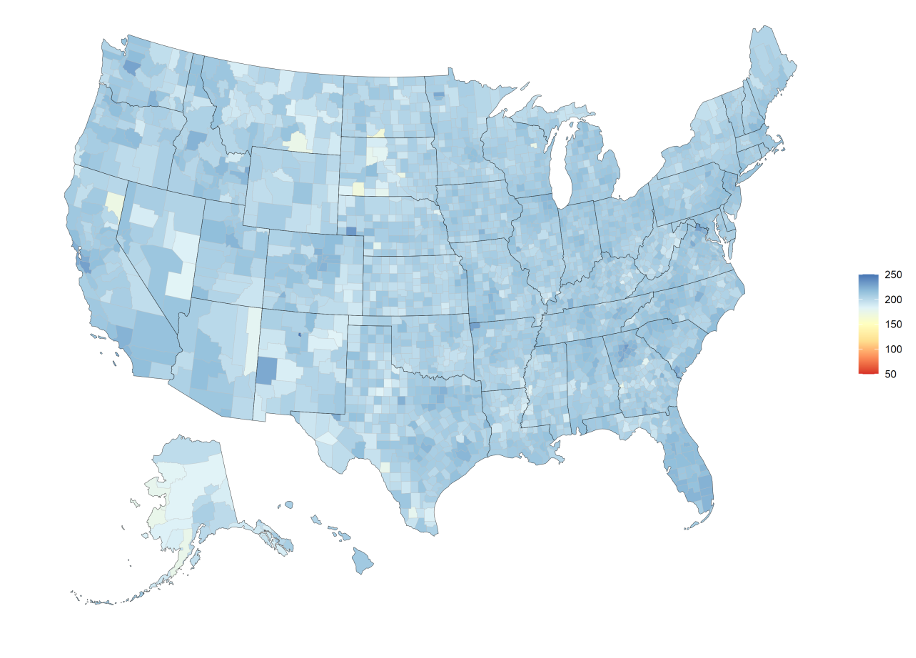
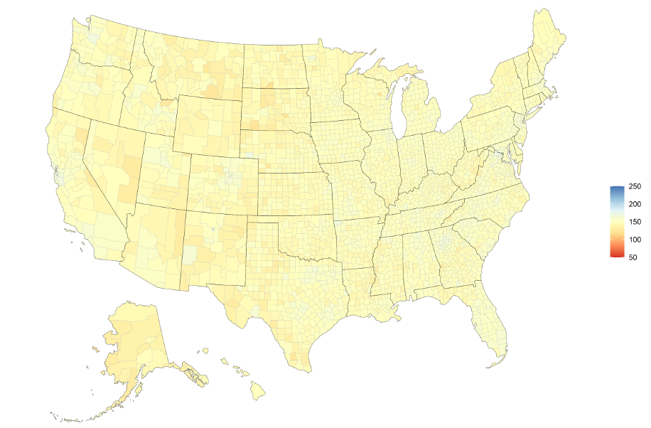
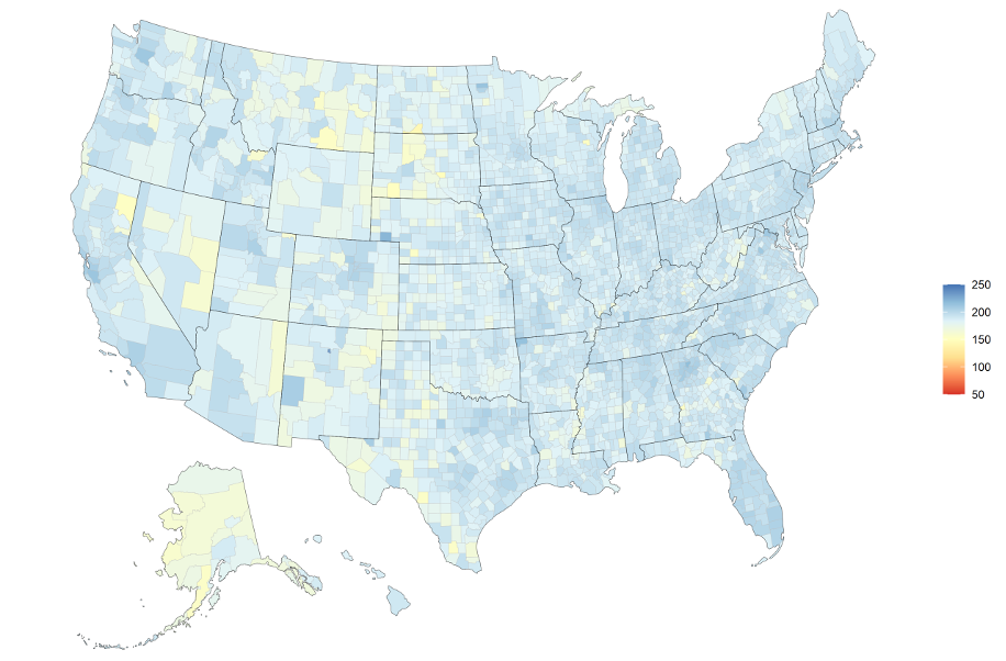
Economic Vitality – Economic Vitality is a custom Synergos Technologies, Inc. variable set included in STI: PopStats™. It measures the association between the number of workers in individual industries and our own proprietary stock market indices. This comes in two versions – indexed and non-indexed (both with history). The non-indexed version shows a more historic picture of stock market changes for the relevant industry mix in local areas. While the indexed version shows the relative performance of the local area versus the nation. This was one of the first indicators that we directed our clients to review with the April estimate. Given the frequent and up-to-date nature of the stock source data, it immediately displayed the stock market changes that were occurring in early April (right after the crash induced by Covid-19. However, there is no longer the depth of decline that was seen in April because as of July 1st the stock market had started to rebound. A possible issue here is that the stock market rebound may not be equally correlated with consumer confidence (one of the main goals of this measure). It may be helpful to adjust these measures by an estimated overvalue, or an estimate of inflated value if you have been historically using the non-indexed Economic Vitality measures. The indexed version should still show the relative performance of local industry mix.
Economic Vitality (non-indexed) by County from January 1st 2020, limits of 50 to 250
Economic Vitality (non-indexed) by County from April 1st 2020, limits of 50 to 250
Economic Vitality (non-indexed) by County from July 1st 2020, limits of 50 to 250
Unaffected field sets: rent, home values, income, enrollment, and labor force. These field sets rely on source data that lags the current period. While they may be affected by current conditions, to what degree cannot be currently determined nor accurately quantified as of this October 2020 release.
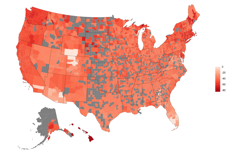
Vacation / Transient Population – One of the hardest hit sectors has been hospitality with hotel occupancy plummeting. Transient Population data in PopStats is based upon hotel, RV, and campground estimated occupancy. We did not adjust April, but with this July estimate we felt the data dictated making a few adjustments. We determined state-level adjustments to be made through researching hotel occupancy rates. While this lacks the geographic granularity we typically require, it helps to differentiate the relatively low impacts in a few areas versus the extreme effects, such as in Hawaii.
Here is a Map of July 2019 to July 2020 percentage change in our estimate of transient population. Grey represents NA values that occur from 0 Transient Pop.
Transient Pop Percentage Change by County from July 1st 2019 to July 1st 2020, limits of 0%,-80%
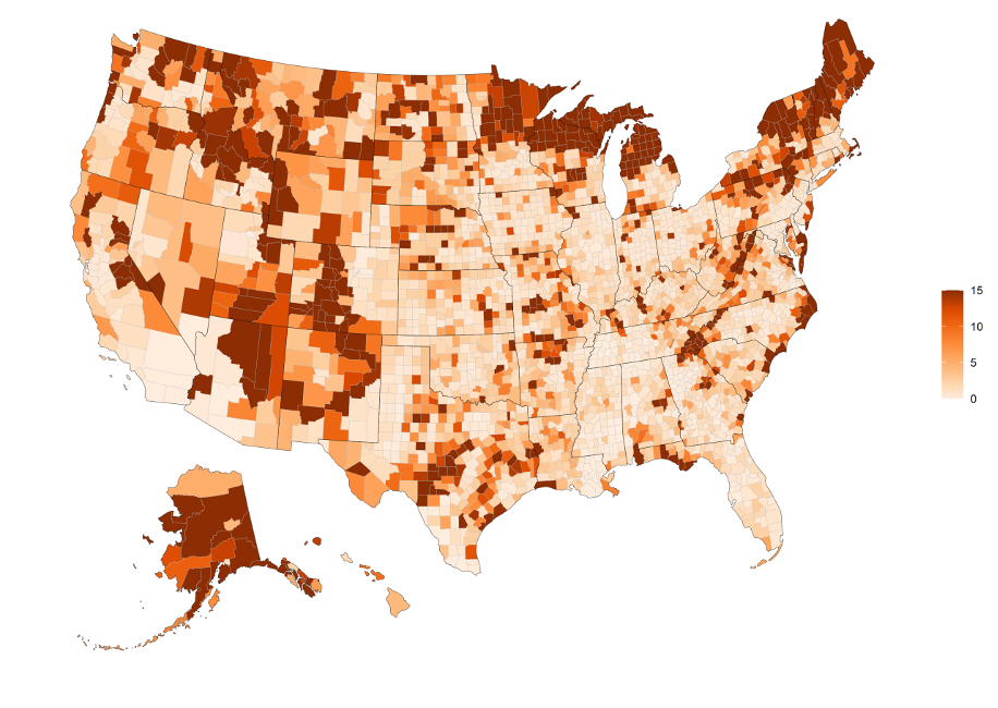
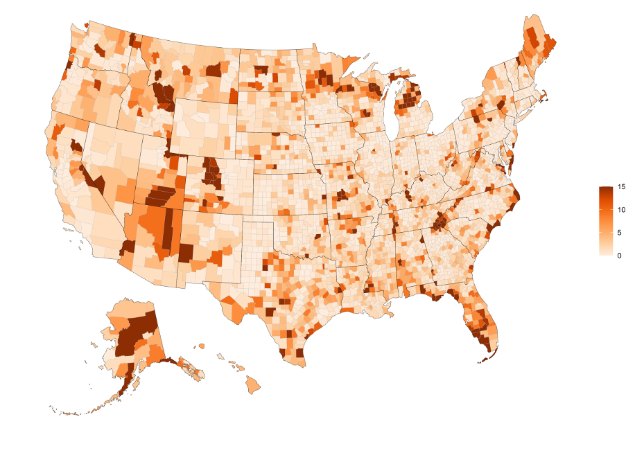
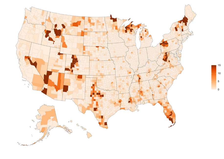
Seasonal Population – No adjustments have been made to seasonal population currently as any change here will take a while to show up in source data. Still, this may be a very good field set to review. People with seasonal homes may have taken up residence in these areas earlier or for longer amounts of time (we’ll touch more on that topic later). An important note about seasonal population is that it is specific to a quarter of occupancy. Therefore, if you want to know the total annual seasonal pop, you would need to total the last 4 quarters. This can be easily done since this field has 8 quarters of history.
The following maps illustrate the Seasonal Population by County for July 2020, April 2020, Jan 2020, and Oct 2019:
Seasonal Pop per 100 Population by County from July 1st 2020, limits of 0,-15
Seasonal Pop per 100 Population by County from April 1st 2020, limits of 0,-15
Seasonal Pop per 100 Population by County from January 1st 2020, limits of 0,-15
Seasonal Pop per 100 Population by County from October 1st 2019, limits of 0,-15
Current Population Change
Population Methodology – Our models for population pick up both decline and growth very accurately. This is due to the use of postal data and delivery statistics in our models. We’ll see the change in our estimates as housing units are built and become occupied or vacant.
Population Percentage Change by County from July 1st 2019 to July 1st 2020, limits of -2%,2%
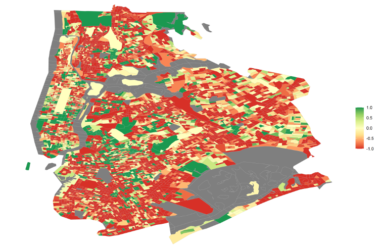
New York and Seasonal housing shift. One of the most publicized areas of out-migration and the resulting population shift has been New York City. Especially during Coviid-19 when everyone was stuck at home in tiny New York apartments. It has also been one of the areas our customers have most asked about.
Net Migration per 100 Pop for New York City by BG from July 1st 2019 to July 1st 2020, limits 1, -1
Net Migration here is determined by looking at population changes year-over-year and removing birth and death components. While this is a high level of out-migration, New York City has also regularly been experiencing out-migration. This is not as much of an exodus as indicated in many publications. That does not mean that there hasn’t been a large exodus from the area. This exodus has not resulted in, as of yet (July 1st), the equivalent decrease in housing ocupancy. That may sound counter intuitive, and for most parts of the country it would be, but there is a unique situation with a sizeable portion of this most recent out-migration event in New York being in large part due to people leaving for their seasonal homes.
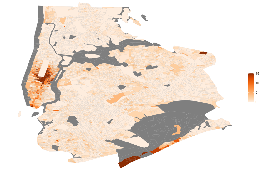
In PopStats, seasonal homes are determined via data from the Census Bureau, and are defined as residences occupied for less than 6 months a year. This is similar to how the IRS, most states and localities determine tax liabilities. We then estimate when those seasonal homes are likely occupied. Concerning the people who left New York, there is a strong chance that they did not sell their homes there or end their leases. Meaning that they are still receiving mail at these addresses. Should they choose to not return and remain in their seasonal residence for more than 6 months, eventually the proportion of seasonal homes in New York will increase and those elsewhere decrease. At this point that result is uncertain. Some people will choose to return to the city. Some will not.
A similar situation to watch are those that have purchased homes elsewhere (or moved seasonally) that are in the process of selling their residences. It is not overly common for a large amout of people to purchase a house and vacate their current residence before selling for an extended period of time. Likewise, those that have abandoned leases will remain as residents of those leases until they complete the move-out process. These situations will be captured further in our estimates over the next several quarters. Ultimately, many of those that have fled the city will still be counted as current residents. We will montior future quarters to see how this changes over time.
Seasonal Pop per 100 Pop New York City by BG from July 1st 2020, limits of 0,-15
Migration – Origin Destination
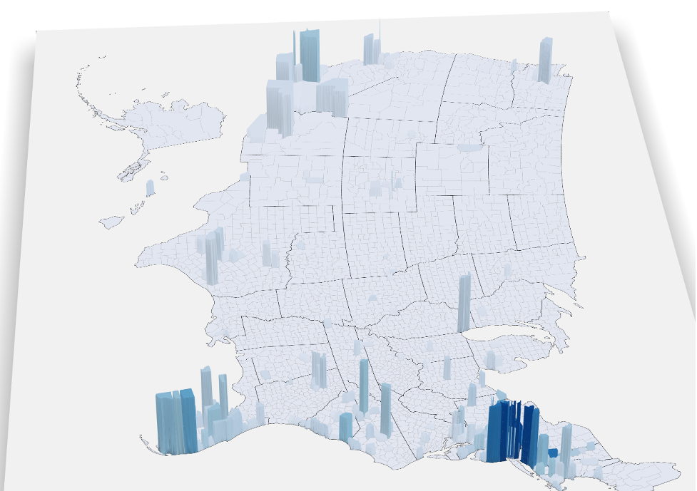
Related to New York, and more generally out-migration across the US, we have been asked about the destination of those moves. Unfortunately, there is not an accurate, current source that we can recommend here. We are able to recommend a slightly older source. The IRS publishes county level data on origin/destination migration data. We include this data in our LandScape product, and it’s estimated to the block group level for the top 50 counties. We have also previously sold a processed version of this dataset to interested customers.
3D Migration Map – IRS 2017 to 2018 Exemptions – Height represent number from the State of New York to each county (limit of 99.5 percentile), Color depicts percentage of that counties inflow from the State of New York (limit of 20%). The higher the bar the more people who moved from NY. The more blue the bar the greater proportion that New Yorkers make up of incoming migration.
In conclusion – There exists no data source with geographic granularity that allows us to say these moves or changes are all attached to Covid-19. We have a “sense” that people are moving out of New York and that early and extended seasonal migration stays might turn into permanent out-migration. However, this is not a hard fact as of yet. The reasoning’s here could also be multifaceted. It could be Covid-19 related, taxes-related, or a combination of these and other reasons. The ability for many more people to work from home, has no doubt allowed for changes of residency – but are these permanent? It’s too early to tell, at least quantifiably. The estimates over time will continue to morph as more data becomes available. We will continue to publish field comparisons, allowing our customers to better understand demographic changes across the country over time.
Interested in other reports? Send us a message and we’ll whip something up for you!