A Migrating Population
Using IRS Data to Track Movement Patterns during Covid-19
A Migrating Population
Using IRS Data to Track Movement Patterns
Understanding the ebb and flow of where people move across the country is crucial to making critical site location decisions. That is why we utilized the latest available IRS data to determine where and from people are moving. We are also able to determine average household income from aggregate income data to understand where higher incomes are moving. The need for past migration trends is more important now more than ever, and something we have commonly been asked about in regards to the COVID-19 pandemic.
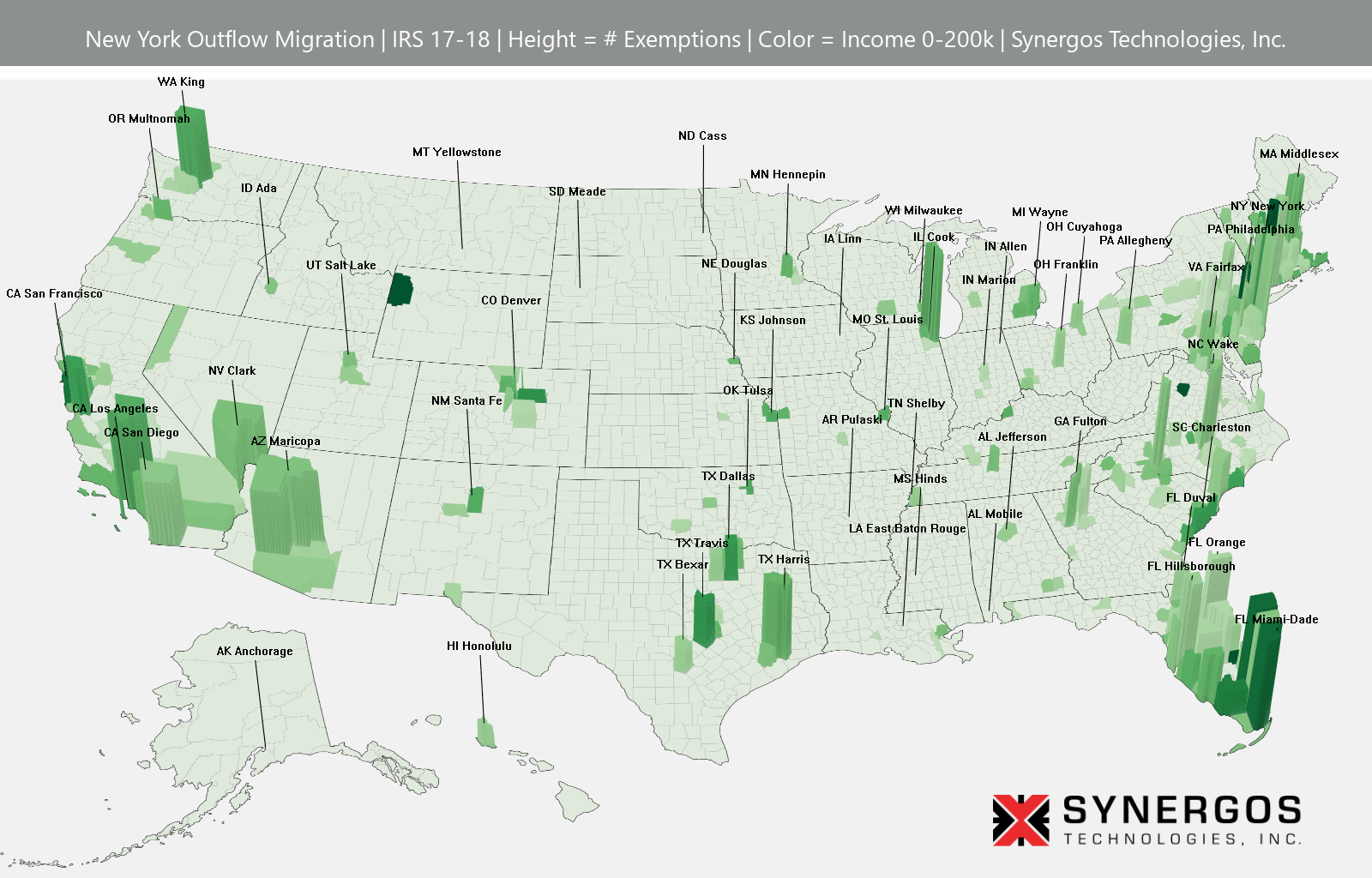
Here’s an example:
Check out the downloads below to view our full library of data visualizations showcasing population migration impacted by COVID-19:
- There are 3 sets of downloads. File names are based on FIPS code:
- Set 1 “OutMigbyState.zip” – includes maps for the 50 states (and DC) and shows the out-migration from the state in question. (51 maps, 48mb) (Download)
- Set 2 “InMig_County.zip” – has county-level maps visualizing inflow for all counties with at least 100 counties of origin(there are 109 counties that fit that criteria). (108 maps, 72mb) (Download)
- Set 3 “InMig_OutST_County.zip” shows the same as previous but excludes those counties in the same state. (108 maps, 72mb) (Download)
- (Download All) (267 maps, 192mb total)
- Reading the maps:
- Height represents the number of IRS exemptions with a 99.5 percentile cut off to remove outliers.
- Color represents income with a limit of $200,000 annual household income. Red represents the destination county.